Two of our font- and CJK-related Adobe Tech Notes were updated this week. One aspect of the update is for issuing a new Supplement or to correct representative glyphs. Another aspect is to typeset the document according to latest practices. For these Adobe Tech Notes, the latter aspect involved changing their static glyph tables into a form that is more efficient, more useful, and more dynamic.
When Adobe Tech Note #5078 (The Adobe-Japan1-6 Character Collection) was last updated, a new-style glyph table was introduced. This new-style glyph table has two primary benefits:
- 500 glyphs are shown per page, comprised of 25 rows and 20 columns. By comparison, the old-style glyph table shows only 120 glyphs per page. Of course, the glyphs are smaller, but keep in mind that the old-style glyph table comes from an era when documents were expected to be printed, while today’s documents are expected to be viewable on displays, and being able to zoom into individual glyphs is the norm.
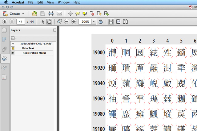
- Each glyph includes registration marks, whose purpose is to denote relative width (in an implicit way), and the height of the em-box. This is no different than the old-style glyph table, but the new-style adds the ability to turn off the display of the (red) registration marks. This is done thanks to layers. InDesign supports layers, and as long as the PDF is exported for Acrobat Version 6.0 or greater (aka, PDF Version 1.5 or greater), the layers are preserved in the PDF file. For some purposes, the glyph registration marks are helpful, but can sometimes be a distraction. Being able to make them go away is a clear benefit of this new-style glyph table.
To better illustrate the second benefit, I have excerpted part of a page from one of the updated Adobe Tech Notes, showing its default state (all layers are visible) when opened in Acrobat or Reader:

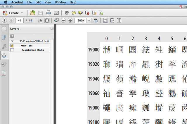
The Layers Panel allows layers to be toggled on/off, in terms of their visibility, and below is the same page, but with the “Registration Marks” layer turned off:

About the Adobe Tech Note updates, in terms of their content…
Adobe Tech Note #5080 (The Adobe-CNS1-6 Character Collection) was updated to reflect Supplement 6, which added 68 glyphs, all of which are hanzi, to support the Hong Kong SCS-2008 character set standard.
Adobe Tech Note #5093 (The Adobe-Korea1-2 Character Collection) was updated to correct the representative glyph for CID+4419. Its left-side component was missing one stroke. CID+4419 currently maps from U+90DE (郞) and U+F92C (郎), the latter of which is a CJK Compatibility Ideograph. As soon as Unicode Version 6.1 is released, there will be a third mapping for this glyph, specifically U+FA2E, which is also a CJK Compatibility Ideograph.
I am planning to update Adobe Tech Note #5078 (The Adobe-Japan1-6 Character Collection) in the next month or two, mainly to make adjustments to bring the explanatory material up-to-date. The representative glyphs will not be changed.
As a reminder to font developers, particularly those who develop CJK fonts, the latest versions of the CMap resources that are associated with our public character collections—Adobe-GB1-5, Adobe-CNS1-6, Adobe-Japan1-6, and Adobe-Korea1-2—are made available at the CMap Resources open source project that is hosted at Open @ Adobe.
