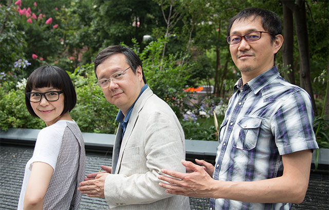
Our most recent project, Source Han Sans, led me to much closer collaboration with our three-person typeface design and development team in our Tokyo office, which is managed by the Taro YAMAMOTO (山本太郎), with Ryoko NISHIZUKA (西塚涼子) as the primary typeface designer, and Masataka HATTORI (服部正貴) serving multiple roles, but mainly typeface design and production. The purpose of this article is to describe this team, with which I have worked for over 20 years on various projects, and its accomplishments from my perspective.
Taro is best described as a jack of all trades, and initially joined Adobe to work on the technology that made Source Han Sans possible. This technology, best described as using multiple master–like components to design glyphs, was originally used as the basis for the Kozuka Mincho (小塚明朝) and Kozuka Gothic (小塚ゴシック) typeface designs that came earlier. Taro’s typeface knowledge and typographic skills, for both Western and Japanese, are unparalleled, and are well recognized by the type industry. Of course, he does a lot of “hands on” work, such as creating and fine-tuning metrics data, to include kerning, and figuring out how to harmonize glyphs from different scripts through scaling, weight-adjustment, or by other means. His skills don’t end there, and include involvement in various standardization activities and teaching typography at universities on a regular basis. Taro’s skills and leadership have resulted in a world-class team that works well together and with others at Adobe and throughout the industry. It is best to think of Taro as the proverbial cement that binds the team together.
I sometimes jokingly refer to Taro’s English-language skills as being his greatest strength, but also his greatest weakness, because his command of the English language is superb. When one expects a one- or two-sentence reply to a seemingly simple question, what comes back is often a half-dozen long paragraphs (perhaps, because the question was not so simple according to Taro’s expertise).
When I asked Taro (for a single paragraph ☺) about his thoughts working on Source Han Sans, he wrote the following:
Although the Chinese writing system has been historically shared by East Asian countries including China, Japan and Korea, each region has inherited, used, developed, and transformed the writing system (and its character shapes) in their own cultural development process.
Hence, designing a typeface that can be used commonly in all of these regions does not mean to design something uniform or unified at all. On the contrary, the reality is that we need to design, in many cases, multiple—and different—ideograph glyph shapes for a single character, as variant glyphs, each of which must be designed to best serve the real usage of the character, as well as the preference in glyph formation in one or more regions. Even before this project began, our team had understood this point to a degree in theory. However, we could really understand its importance, after we started working on the Source Han Sans typeface. What we learned in the designing process is that a Pan-CJK font needs to have a typeface design that contains multiple forms adapted to different cultures. Still, the designer must preserve and embed his or her own original “design” characteristics, consistently into all glyphs. It was really a difficult challenge. (Of course, there can be cases where only one glyph shape can be used for one encoded character, commonly throughout all the regions, and such can help us reducing the font file size.)
As evidenced by the how warmly Source Han Sans has been received by the user community, Ryoko did an outstanding job as the primary typeface designer, which required her to look beyond Japanese for the first time, and also necessitated interaction with the Chinese typeface designers. My role in this interaction was to help Ryoko, as the designer, to determine which glyphs can be shared across one or more languages or regions.
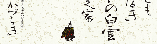
Although I didn’t interact much with Ryoko during her earlier years as a member of this team, as her responsibilities grew, so did her interactions with me and others on the type team. Ryoko initially contributed to the Kozuka fonts, and her earliest independent typeface design accomplishments as a member of the team were the Ryo (りょう) kana fonts, which added value to the Kozuka and other Japanese fonts by offering alternate kana designs whose purpose is to enhance readability. The Ryo kana fonts and the Kozuka Std fonts were eventually fused together as the Ryo PlusN fonts, which remain popular to this day. I am sure that she is also very pleased with how her award-winning Kazuraki (かづらき) font has been received throughout the font development community, and which serves as an example for others to follow. Kazuraki began as a pet typeface design project called Teika (汀花) that won the Silver Prize during Morisawa’s 2002 International Typeface Design Competition. We were all proud to see this personal project evolve into a highly-acclaimed commercial font, and we feel the same about Source Han Sans.
Be sure to read Nicole Miñoza’s recent interview that was published on the Typekit blog.
While Ryoko led the typeface design of Source Han Sans, Masataka took charge of managing, adjusting, and expanding the Element Library that served as the basis for designing the glyphs for the tens of thousands of ideographs. He deserves special recognition because he provides expertise that is often overlooked, perhaps due to the seamless nature in which he delivers it. Ryoko describes Masataka as “an engineer who understands typeface design,” and I couldn’t agree more. In my experience, the marriage of these skills is relatively rare, and the end result is superior products. Considering the complexity of the Element Library, which includes Library Elements (LEs) with up to six axes (64 masters), this was a non-trivial task that required great design skills and an unprecedented level of precision. Masataka also excels at production—the preparation of outline data that is handed off to me for final production. These skills come from knowing how to wield our AFDKO (Adobe Font Development Kit for OpenType) tools, whose sources are now available as open source. Masataka has even led seminars that demonstrate how to effectively use AFDKO tools to develop better OpenType fonts. Such activities put Masataka into the spotlight, which is something that he very much deserves.
I asked Masataka the same question about Source Han Sans, and he responded as follows (my English translation follows what he originally wrote in Japanese):
はじめてPan-CJKフォントプロジェクトの構想を聞かされ、膨大な文字数、デザイン的な課題、技術的な課題、製作期間やリソース、そして韓国・中国のデザイナーとの共同作業などすべてを考慮した上で東京チームが制作の中心となってプロジェクトか実現可能かどうか、本社のディレクターに尋ねられたとき、正直まったく確証のないまま「できる」と言ってしまった。それ以来3年間、常にこのプロジェクトのことばかり考えてきた。最初は安定しない文字作成ツールと格闘し、パートーナー関係にある日本・韓国・中国のデザイナーに向けて文字デザインと制作行程のトレーニングを行い、後半は膨大な文字の品質チェック、主に日本語で使われるグリフセットやOpenTypeフィーチャーの提案や実装に多くの時間を費やした。最初はまったくの手探りで、先の見えないプロジェクトでも、すべきことを1つずつクリアーしていくと、いずれゴールが見えてくるとあらためて思った。
Upon first hearing about the Pan-CJK Font Project concept, and when asked by the director at headquarters to be the center of production and whether the project was feasible, the Tokyo team considered all of the factors, such as the huge number of glyphs, the design and technological challenges, the production period and resources, along with collaboration with designers in Korea and China, and we ultimately said “we can do it” with no evidence at all to back it up. I have been constantly thinking about only this project for the past three years. At first I struggled with instabilities in the glyph creation tool, and provided production process and glyph design training to the Japanese, Korean, and Chinese designers who were in the partner relationship. For the second half, I spent a lot of time checking the quality of an enormous number of glyphs, implementing the glyph set used mainly for Japanese, and making suggestions for OpenType features. At first, I was completely feeling my way, and I couldn’t see the end of the project, but as we cleared what we needed to be done one by one, I once again thought that the goals were in sight.
We consider it our job to lead the industry in typeface design and type technology, and our team in Tokyo has played a critical role toward that goal. To summarize, this team produces outstanding type products, which impress not only the rest of the type team, but also Adobe as a company and our vast number of customers. When I consider how well this team works together—almost like a family—with me and the rest of the type team, I can think of no better name for them than The Three Musketeers, which is expressed as 三銃士 (sanjūshi) in Japanese.
Great project however we’ve been trying to test Source Han Sans CN via Typekit and it appears to work as expected in Adobe InDesign CC 2014 however the alignment changes in Microsoft Word Office 2011.
Please help! See example here.
Thank you,
TB
This is a known issue with MS Word 2011 on OS X, and is being tracked here. As far as we are aware, the fonts are okay. The fonts work fine on MS Word on Windows.