As a follow on to our seven-year-old May of 2009 article of the same name, several things have happened with the Adobe Clean family that have yet to be reported, and which have CJK implications. Hence the reason for spending my Sunday morning writing this article.
In the following year, 2010, I developed and deployed a Japanese version of Adobe Clean named Ryo Clean PlusN (りょう Clean PlusN in Japanese), and then in 2015, I developed and deployed a Pan-CJK version named Adobe Clean Han (Adobe Clean 黑体 in Simplified Chinese, Adobe Clean 黑體 in Traditional Chinese, Adobe Clean 角ゴシック in Japanese, and Adobe Clean 고딕 in Korean). These typeface families are Adobe corporate fonts that are meant to be used for product literature, for serving to Adobe websites, and for use by Adobe apps. They are not meant to be used by our customers, but I suspect that the readership of this blog may be interested in some of the development details. If this interests you, please continue reading.
Ryo Clean PlusN
Ryo Clean PlusN is simply Ryo Gothic PlusN with 525 proportional and full-width Latin glyphs replaced by their Adobe Clean equivalents. The exact CIDs and CID ranges are 1–230, 780–841, 8720–8949, 9354, 9779, and 12870. The Ryo Clean PlusN family includes six weights—ExtraLight, Light, Regular, Medium, Bold, and Heavy—though the Ryo Gothic PlusN family includes seven, with UltraHeavy being the additional weight.
(Ryo Gothic PlusN itself is a fusion of two typeface designs: Ryo Gothic, which is a kana-only typeface family, and Kozuka Gothic.)
In order to prevent the tail from wagging the dog, the Adobe Clean design was adapted, through interpolation and scaling, to better harmonize with the Ryo Gothic PlusN design. The table below details the weight names and the corresponding Adobe Clean interpolation and scaling parameters that were used (the Width axis is the same for all weights, specifically 830 for the proportional glyphs and 1000 for the full-width ones):
| Weight | Weight Axis | Scaling Factor |
|---|---|---|
| EL | 40 | 105% |
| L | 165 | 109% |
| R | 290 | 110% |
| M | 510 | 111% |
| B | 700 | 112% |
| H | 840 | 116% |
In other words, the Adobe Clean glyphs in Ryo Clean PlusN are slightly larger than the original glyphs. The effect of this will be visualized in the next section.
Adobe Clean Han
Perhaps of more interest, at least to me, is the Adobe Clean Han family. As its name suggests, this typeface family is Source Han Sans with Western portions replaced by their Adobe Clean equivalents. Contrary to what was done for Ryo Clean PlusN, the proportional Latin, Greek, and Cyrillic glyphs were replaced, and the full-width Latin glyphs were left as-is. (A very small number of Source Han Sans glyphs were not replaced, 16 to be exact, because Adobe Clean does not include them.)
Unlike Source Han Sans, I developed only the language-specific OTFs, along with the corresponding OTCs. In other words, I didn’t bother developing the region-specific subset OTFs, which are not Pan-CJK. (If it were up to me, the region-specific subset OTFs of Source Han Sans would be nuked, because they effectively defeat the purpose of developing a Pan-CJK typeface design.)
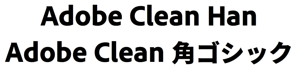
In order to prevent the tail from wagging a much larger dog, the Adobe Clean design was once again adapted, through interpolation and scaling, to better harmonize with the Source Han Sans design. This included using slightly different names for specific weights, to match corresponding weight names of Adobe Clean. The image below shows the Regular and Bold weights of Adobe Clean Han (left) and Adobe Clean (right) using the same point size, which visualizes the effect of the adaptation process:
The table below details the weight names and the corresponding Adobe Clean interpolation and scaling parameters that were used:
| Weight | Weight / Width Axis | Scaling Factor |
|---|---|---|
| ExtraLight | 0 / 860 | 110% |
| Light | 141 / 860 | 110.8% |
| Normal | 260 / 860 | 111.6% |
| Regular | 312 / 860 | 112% |
| Bold | 475 / 860 | 114% |
| ExtraBold | 660 / 810 | 119% |
| Black | 780 / 810 | 122% |
The January of 2015 article detailed how this was similarly done for Source Han Sans and Noto Sans CJK.
(For those readers who feel compelled to point out that Source Han Sans is open source, please bear in mind that Adobe also owns its copyright, which gives us the flexibility to produce non–open source derivatives, such as Adobe Clean Han.)
In closing, I’d like to state that Adobe Clean Han has been served to this blog via Adobe Fonts (formerly Adobe Typekit) since mid-2015.
Could you let me know what font editor was used for creating this font?
In terms of converting the name-keyed font sources into each weight’s CIDFont resource, which is your fundamental question based on your separate email on the same topic, our AFDKO tools were used, and the workhorse is the command-line mergeFonts tool, which performs the actual name to CID conversion, and also sets up the multiple FDArray elements. My Manipulating CID-Keyed Fonts Using AFDKO Tools workshop that was delivered during ATypI Hong Kong 2012 should prove to be helpful to understand how to use the AFDKO tools to accomplish this. You can also find more resources in this blog on this topic by searching using the mergeFonts keyword. Adobe Tech Note #5900 should also prove to be useful (the link will take you to the start of the Chinese translation).