This article is largely a test, but also serves to start the process of resurrecting L2/14-006 (Proposal to add standardized variation sequences for nine characters) for discussion at UTC #151 in early May.
Liang Hai (梁海) brought up this document for discussion at UTC #150 last week, and while I had an opportunity to have it accepted by the UTC, to be included in Unicode Version 10.0 (June, 2017), I decided that it was prudent to instead prepare a revised proposal that is more complete, mainly because L2/14-006 was submitted and discussed prior to the first release of the Adobe-branded Source Han Sans and Google-branded Noto Sans CJK Pan-CJK typeface families. This functionality was implemented in those typeface families via the 'locl' GSUB feature, which requires the text to be language-tagged. In other words, I learned a lot since L2/14-006 was discussed, and prefer to submit a more complete proposal, even if it means waiting for Unicode Version 11.0 (June, 2018).
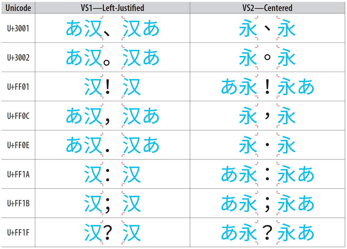
The premise of this proposal is that some characters require different glyphs, depending on the context in which they are used. Western punctuation is generally aligned to Western typographic features, such as the baseline, x-height, or cap-height. CJK punctuation is generally aligned to the top, center, or bottom of the em-box. Some characters, such as the smart quotes, can also vary in their relative widths, specifically proportional versus full-width.
Please click here to view a PDF file that provides a visual for each proposed Standardized Variant in a table, using Western form, East Asian form, and East Asian fullwidth form as the style names, and also includes the corresponding entries that would be added to the StandardizedVariants.txt file.
I am planning to add to this proposal Standardized Variants for eight full-width punctuation characters, which differ in their placement within the em-box. China, for example, uses left-justified forms, and Taiwan uses centered forms. Japan uses left-justified periods and commas, but centered exclamation points, question marks, colons, and semicolons. These are generalized as left-justified form and centered form, and you can view the corresponding PDF file by clicking here.
2017-02-13 Update: This proposal has been posted to the UTC Document Register as L2/17-056, and will be discussed during UTC #151 in May. Note that a fully-functional OpenType/CFF font is a PDF attachment, which can be extracted, installed, and used.
I welcome any and all feedback.