
I will open this article by stating that OpenType features are almost always GSUB (Glyph SUBstitution) or GPOS (Glyph POSitioning). The former table specifies features that substitute glyphs with other glyphs, usually in a 1:1 fashion, but not always. The latter table specifies features that alter the metrics of glyphs, or the inter-glyph metrics (aka kerning).
The focus of this particular article will be the 'vert' (Vertical Alternates) feature, which substitutes a glyph with the appropriate glyph for vertical writing, and is invoked when in vertical writing mode. In other words, it’s a GSUB feature, and one that needs to be invoked for proper vertical writing. Current implementations that support the 'vert' GSUB feature, which tend to be CJK fonts, substitute glyphs with their vertical forms on a 1:1 basis, though language-tagging may affect the outcome for Pan-CJK fonts, such as the Adobe-branded Source Han Sans and the Google-branded Noto Sans CJK, which support multiple languages.
As the title of the article suggests, what problem is solved by implementing a 'vert' GPOS (not GSUB) feature? To cut to the chase, it’s combining jamo in vertical writing mode. A small number of other characters also benefit from the 'vert' GPOS feature.
Combining jamo is supported via the 'ljmo' (Leading Jamo Forms), 'vjmo' (Vowel Jamo Forms), and 'tjmo' (Trailing Jamo Forms) GSUB features, applied in that order. Sequences of two or three characters, made up of a [L]eading consonant and a [V]owel, or a [L]eading consonant, a [V]owel, and a [T]railing consonant, which can be abbreviated as LV and LVT, are processed through these three GSUB features to form a rectangular grapheme cluster that corresponds to an archaic hangul syllable.
The glyphs that correspond to L are spacing, behave like normal glyphs, and specify the horizontal advance for the LV or LVT syllable. For Source Han Sans and Noto Sans CJK, the horizontal advance is 920 units. The V and T glyphs are special in a couple of ways. One is that they have a zero-unit horizontal advance, and another is that they are positioned to the left of the origin (coordinate 0,0). This ensures that they appear within the em-box that is specified by the L glyphs. For implementations that support combining jamo, this works, as evidenced by the following inline LVT example: 가ퟋ (<1100 1161 D7CB>). Well, at least this works in horizontal writing mode…
Three things need to happen in order for the V and T glyphs to be properly positioned in vertical writing mode:
- The glyphs need to have a zero-unit vertical advance. The default vertical advance is 1000 units for OpenType/CFF fonts, which means that it needs to be overridden.
- The glyphs need to be shifted 1000 units up, so that they appear in the em-box of the L glyph. The vertical origin needs to be overridden accordingly
- The glyphs need to be shifted to the right, to the tune of one-half the horizontal advance of the L glyphs (920 units for Source Han Sans and Noto Sans CJK). In terms of the vertical origin, the horizontal advance of the glyph is centered at X=500, which means that the V and T glyphs, with a zero-unit horizontal advance, are shifted to the right until X=0 becomes X=500. For Source Han Sans and Noto Sans CJK, this means that a right-shift value of 460 units needs to be specified.
The first two changes can be specified via 'vmtx' table overrides, but the third one cannot, because it requires an X-axis shift. This then leads us to the 'vert' GPOS feature, specifically its XPlacement value record that can specify an X-axis shift. For Source Han Sans and Noto Sans CJK, the correct setting is 460 units, for reasons explained above.
I need to point out that I am not the first one to figure this out. GitHub user @dohyunkim has implemented this almost three years ago in his hcr-lvt open source project.
Going one step further, the 'vmtx' table overrides can also be specified via the 'vert' GPOS feature, specifically using the YPlacement and YAdvance value records. At least for OpenType/CFF fonts that include a 'VORG' table, this approach consumes slightly less space than the 'vmtx' table overrides plus 'vert' GPOS feature approach. In addition, the treatment of U+20DD (COMBINING ENCLOSING CIRCLE), U+3099 (COMBINING KATAKANA-HIRAGANA VOICED SOUND MARK), and U+309A (COMBINING KATAKANA-HIRAGANA SEMI-VOICED SOUND MARK) also benefit from either approach, because their glyphs are positioned like the V and T glyphs, and also have a zero-unit horizontal advance.
So, which of the two approaches is best?
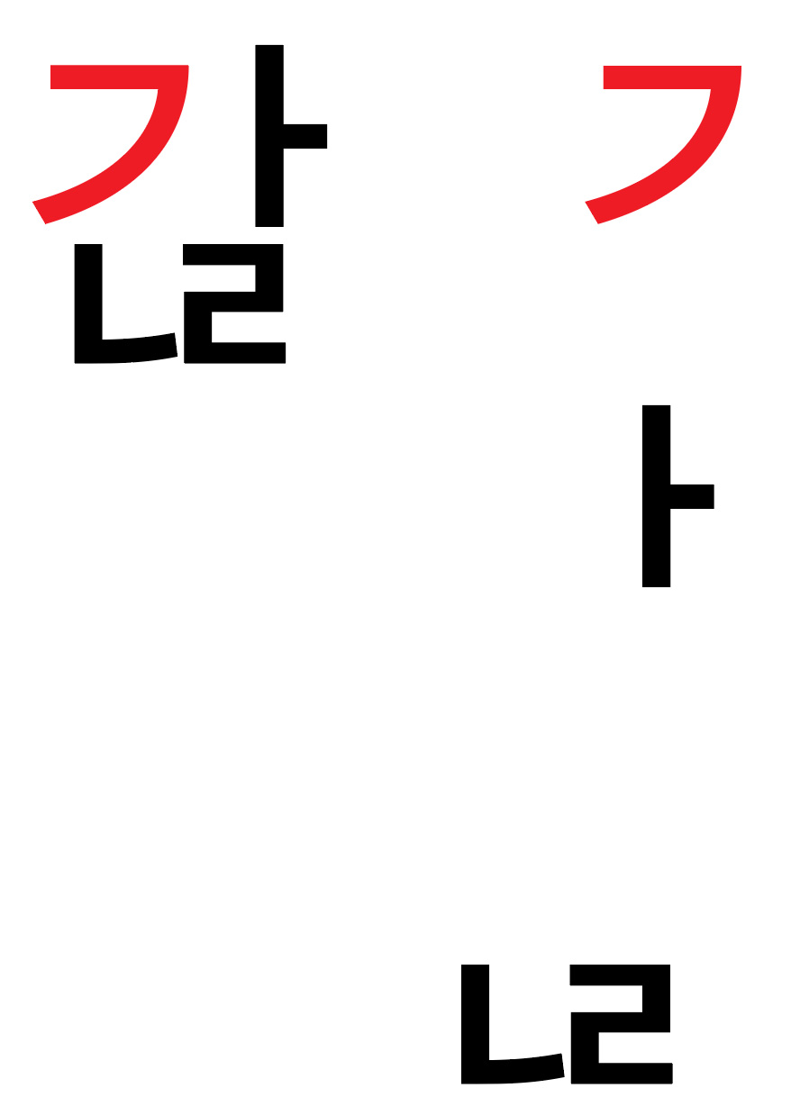
The “'vmtx' table overrides plus 'vert' GPOS feature” approach means that combining jamo in vertical writing will be partially broken in environments that do not support the 'vert' GPOS feature. The glyphs will be placed correctly along the Y-axis and will have a zero-unit vertical advance, but will appear half the horizontal advance of the L glyph to the left. Using the example sequence, <1100 1161 D7CB>, the left part of the image below shows how it should appear when everything is working correctly regardless of writing direction, and the right part shows what happens in vertical writing when the 'vmtx' table overrides are working, but the 'vert' GPOS feature is not supported (the L glyph is colored in red for easy identification):

The “'vert' GPOS feature only” approach means that combining jamo will be completely broken in environments that do not support the 'vert' GPOS feature, which makes the lack of support a lot more obvious. Using the same example sequence, the left part of the image below once again shows how it should appear when everything is working correctly regardless of writing direction, and the right part shows what happens in vertical writing when the 'vert' GPOS feature is not supported:
Another solution, of course, is to add vertical versions of the V and T glyphs that are positioned correctly along the X-axis and thus require no additional adjustment, and therefore require only 'vmtx' table overrides. At least for Source Han Sans and Noto Sans CJK, this is a non-starter, because they include 738 combining V (190) and T (548) glyphs, and their glyph set is literally full.
For those who want to follow the ongoing discussion, please see Source Han Sans Issue #34 and Noto CJK Issue #79. While the latter includes links to test fonts that implement the two approaches described in this article, you can get NotoSansCJKjp-Regular.otf ('vmtx' table overrides and the 'vert' GPOS feature) and NotoSansCJKkr-Regular.otf ('vert' GPOS feature only) here.
Photo by DocChewbacca. Used by permission. Click on the photo to view the original image.