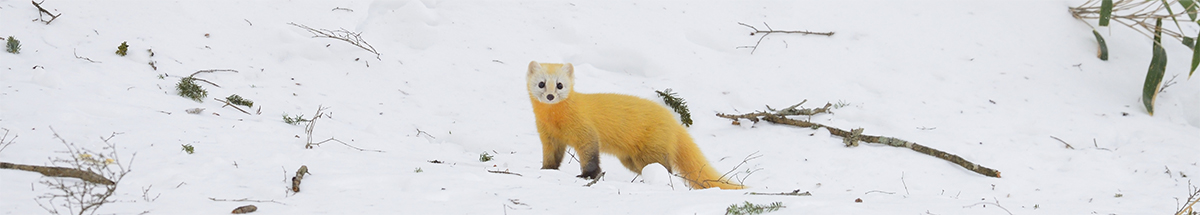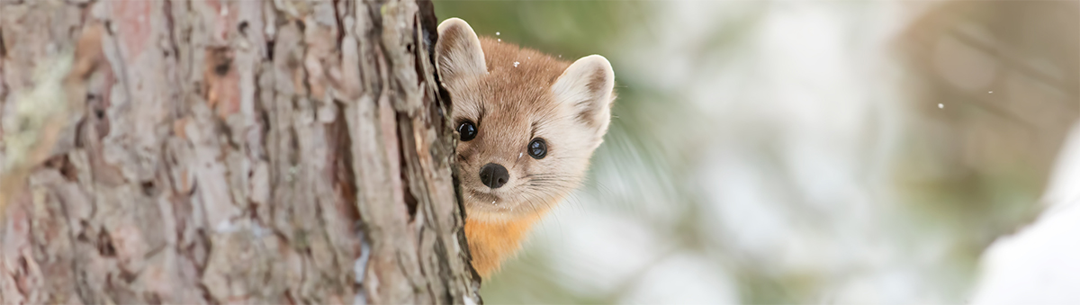
(All of the marten photos that are used in this article can be found on Adobe Stock)
The purpose of this article is to provide technical details of how the Ten Mincho—貂明朝 in Japanese—typeface and its fonts, which are initially being offered as a Typekit exclusive, were developed, and how they boldly go where no Japanese font has gone before. For more details about the Ten Mincho typeface design itself, which is probably much more interesting than this really long and technical article, I encourage you to read the official announcement (日本語) on the Typekit Blog. As stated in the official announcement, this new Adobe Originals Japanese typeface is unique in many ways, and should serve as inspiration for type foundries and typeface designers in Japan and elsewhere.
Adobe-Identity-0 ROS
Ten Mincho, which includes 9,117 glyphs that are shared by its two faces, Regular and Italic, is yet another CID-keyed OpenType/CFF font that is based on the special-purpose Adobe-Identity-0 ROS (Registry, Ordering & Supplement). While there are now numerous open source fonts that are based on this special-purpose ROS—almost all of which are available on GitHub—it is Adobe’s second commercial typeface to make use of it. Kazuraki—かづらき in Japanese—was the first.
Like what I did for the open source Source Han Sans (源ノ角ゴシック) and Source Han Serif (源ノ明朝) Pan-CJK typeface families, Unicode-based working glyph names were used to make the production workflow smooth and predictable, and once again proved to be useful in insulating me from CID changes between development versions. For example, the working glyph name for the old-style italic glyph for U+0030 0 (zero) is uni0030.oldstyle.ital, and the one for U+8C82 貂 is uni8C82.

Kanji
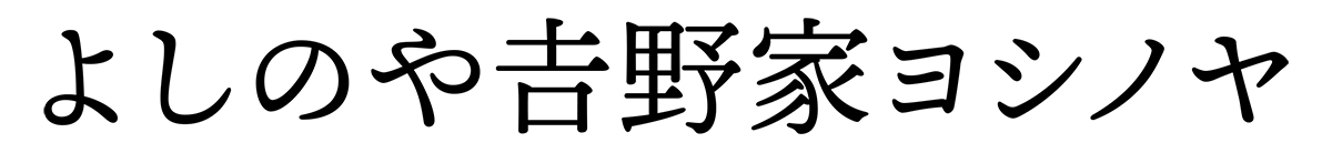
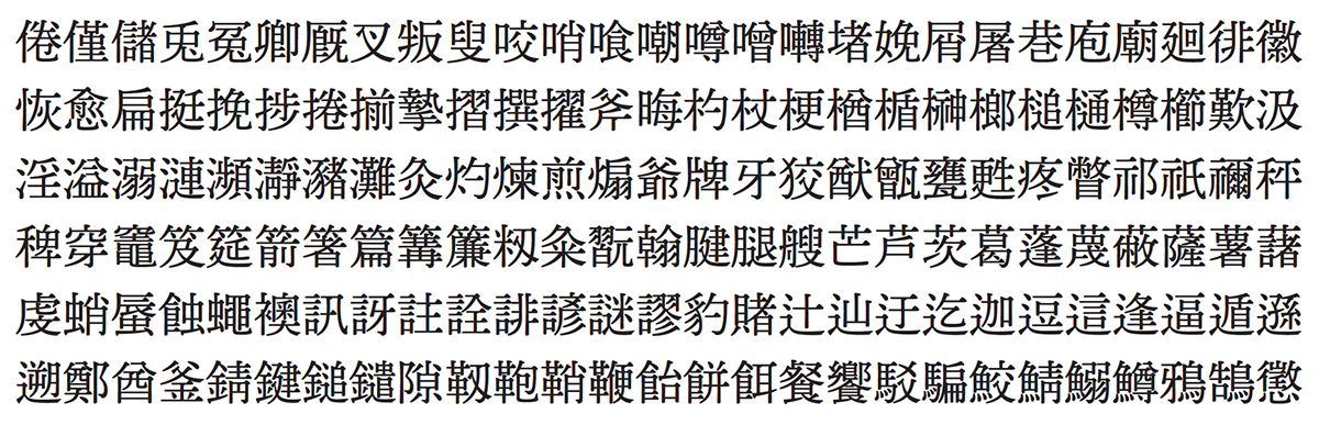
Ten Mincho is fundamentally a Japanese typeface, meaning that it includes glyphs for several thousand kanji, with the actual number being 6,469. While the expected kanji are supported, meaning those in JIS X 0208 Levels 1 and 2, along with support for the latest Jōyō Kanji (常用漢字) and Jinmei-yō Kanji (人名用漢字) sets, what is somewhat unique about this typeface is that ① no unencoded variant forms are included, which implies that all of the glyphs for kanji are encoded; ② it is only JIS2004-savvy, which affects the glyphs for approximately 160 kanji, and which also means that the corresponding JIS90 glyphs are not included; and ③ Ten Mincho is a display typeface whose glyphs are greatly influenced by the dynamic characteristics of hand-written characters, and while its glyphs are closer to JIS2004-style than JIS90-style, they may not completely adhere to the JIS2004 standard. Glyphs for a very, very small number of additional kanji are included, and while I won’t reveal all the details, one clue can be found by dining at the Japanese restaurant chain that is named 𠮷野家.
As a result of not including glyphs for unencoded variant forms of kanji, the usual kanji-related OpenType GSUB (Glyph Substitution) features that one would expect to find in a fully-featured JIS2004-savvy OpenType Japanese font—'expt', 'hojo', 'jp78', 'jp83', 'jp90', 'nlck', and 'trad'—have been explicitly excluded, mainly because they would not provide customers with any meaningful benefits.

Unicode Coverage
The UTF-32 'cmap' tables specify 7,762 mappings, 244 of which are the result of mapping multiple code points to the same glyph. The Regular and Italic faces differ by exactly 595 mappings. For those who are interested, I prepared a 214-page Unicode-based glyph synopsis PDF that includes bookmarked sections for Regular and Italic. The upper-left corner includes annotations that indicate whether the default glyph is full-width (F), half-width (H), proportional (P), wide (W), or zero-width (Z). The section for the Italic face additionally includes an “I” annotation in the upper-right corner to explicitly indicate which default glyphs are italic.

Rich Latin Support
Another way in which Ten Mincho differs from typical OpenType Japanese fonts is that it includes a very rich and fully-functional Latin subset, along with the corresponding OpenType features. In fact, all of the glyphs of Ten Oldstyle, to include its italic glyphs, are included in Ten Mincho. The only things that are different are that Ten Oldstyle is offered in multiple weights, and its fonts are name-keyed; there is only a single weight of Ten Mincho, and its two faces—Regular and Italic—are CID-keyed. The Ten Oldstyle glyphs in Ten Mincho were adjusted to match the weight of the Japanese glyphs, and have been scaled—for those who care, the scaling factor was 110%—to also match the Japanese glyphs.
While we have historically included italic glyphs in our OpenType Japanese fonts, specifically the ones whose glyph set is Adobe-Japan1-4 or greater, we have never included glyphs for small caps, tabular figures, old-style figures, and so on. As a result of this rich set of Latin glyphs, Ten Mincho includes an astonishing 32 OpenType GSUB features, along with seven GPOS (Glyph Positioning) ones.
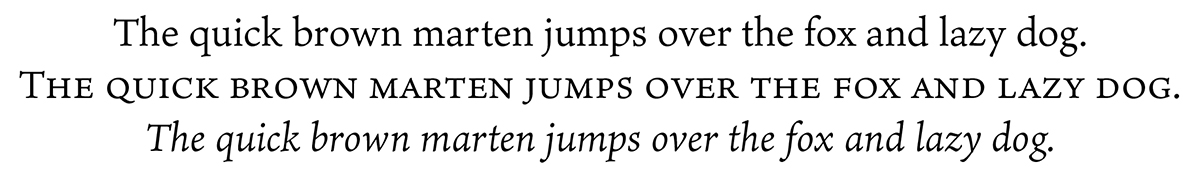
The image below shows the Ten Mincho upright, small cap, and italic glyphs:
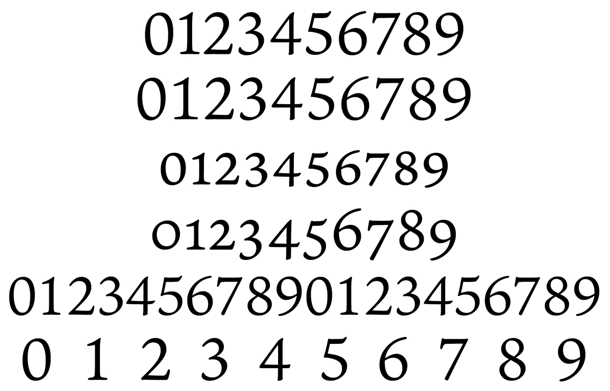
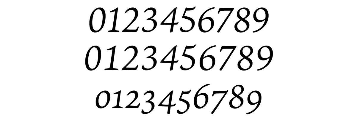
The image below shows the standard (proportional), tabular, small cap, old-style, half-width, and full-width figure glyphs that are included in Ten Mincho:
The Italic face also includes its own standard, tabular, and old-style figures as shown below:

OpenType Features
There are the 32 OpenType GSUB features specified in Ten Mincho, listed here in alphabetical order (the four that are asterisked are intentionally excluded from the Italic face):
- aalt (Access All Alternates)
- case (Case-Sensitive Forms)
- ccmp (Glyph Composition / Decomposition)
- c2sc (Small Capitals From Capitals)*
- dlig (Discretionary Ligatures)
- dnom (Denominators)
- frac (Fractions)
- fwid (Full Widths)
- hist (Historical Forms)
- hwid (Half Widths)
- ital (Italics)*
- liga (Standard Ligatures)
- lnum (Lining Figures)
- locl (Localized Forms)
- numr (Numerators)
- onum (Oldstyle Figures)
- ordn (Ordinals)
- pnum (Proportional Figures)
- pwid (Proportional Widths)
- ruby (Ruby Notation Forms)
- salt (Stylistic Alternates)
- sinf (Scientific Inferiors)
- smcp (Small Capitals)*
- ss01 (Stylistic Set 1, named “Small Cap Figures”)*
- ss02 (Stylistic Set 2, named “Marten” in English, and 貂 in Japanese)
- ss03 (Stylistic Set 3, named “Black and White” in English, and 白黒 in Japanese)
- subs (Subscript)
- sups (Superscript)
- tnum (Tabular Figures)
- vert (Vertical Writing)
- vrt2 (Vertical Alternates and Rotation)
- zero (Slashed Zero)
And, here are its seven GPOS features:
- halt (Alternate Half Widths)
- kern (Kerning)
- palt (Proportional Alternate Widths)
- vert (Vertical Writing)
- vhal (Alternate Vertical Half Metrics)
- vkrn (Vertical Kerning)
- vpal (Proportional Alternate Vertical Metrics)
Yes, the 'vert' GPOS feature is included, which benefits the glyphs for U+3099 (COMBINING KATAKANA-HIRAGANA VOICED SOUND MARK) and U+309A (COMBINING KATAKANA-HIRAGANA SEMI-VOICED SOUND MARK) when used in vertical writing. Unfortunately, the number of environments that support this particular GPOS feature is currently limited, but it is nonetheless useful to include it for the longer term. Baby steps…
Italic
The Regular and Italic faces of Ten Mincho share the same glyph set that is comprised of 9,117 glyphs, and differ in that 595 characters are mapped to italic glyphs in the Italic face’s 'cmap' table. The Italic face also lacks a small number of OpenType GSUB features, specifically 'c2sc', 'ital', 'smcp', and 'ss01' (“Small Cap Figures”), because the corresponding italic glyphs are either default or not present in the glyph set. The Regular face is style-linked with the Italic face for applications that support style linking. The Regular face also includes the 'ital' (Italics) GSUB feature that serves as an alternate way of accessing the italic glyphs.

OpenType Collection
Although the Ten Mincho fonts that are served by Typekit are individual OpenType/CFF fonts—for Regular and Italic—the two faces actually share the exact same glyph set, meaning that the glyphs in their 'CFF ' (Compact Font Format) tables are 100% identical. This means that it is possible to build an OpenType Collection (aka OTC) that includes both fonts. We have actually done this, and it will be made available through Fontspring sometime next year for those who purchase a license for both faces. While the individual OTFs are just under 4MB in size, the OTC that includes both fonts is a mere 125K larger than either OTF. Of course, this significant size savings is mainly due to the sharing of the 'CFF ' table.
The minimum system requirements for the OTC, in terms of Windows and macOS, is Windows Version 1607 (aka Version 10 Anniversary Update) and OS X Version 10.8 (aka Mountain Lion). Adobe apps that are Version CS6 and greater also support OTCs.
Language-sensitive Features
Unlike conventional OpenType Japanese fonts, Ten Mincho includes the 'locl' (Localized Forms) GSUB feature, which applies glyph substitutions based on how the text of a document is language tagged. One lesson that we learned from the Source Han Pan-CJK typefaces is that the proportional quotes—upright (U+0022 and U+0027) and smart/curly (U+2018, U+2019, U+201A, U+201C, U+201D, and U+201E)—benefit from having separate forms for Western and CJK text. The default forms are for Western text, and language-tagging the text for Japanese invokes the separate Japanese forms that are still proportional, but which are aligned to the em-box for use with kana and kanji.
In addition, there is a small number of symbols whose glyphs are full-width or proportional by default, and for which both glyphs are present in the glyph set, and the 'locl ' GSUB feature handles them as described below:
- For the following characters, default full-width glyphs are substituted with proportional ones when the language is set to English or other Latin-based language: U+00A7 §, U+00B0 °, U+00B1 ±, U+00B6 ¶, U+00D7 ×, U+00F7 ÷, U+03C0 π, U+2010 ‐, U+2015 ―, U+2020 †, U+2021 ‡, U+2026 …, U+2030 ‰, U+2032 ′, U+2033 ″, U+2113 ℓ, U+2190 ←, U+2191 ↑, U+2192 →, U+2193 ↓, U+2202 ∂, U+2211 ∑, U+221A √, U+221E ∞, U+2260 ≠, U+25A0 ■, U+25B2 ▲, U+25B3 △, U+25B6 ▶︎, U+25B7 ▷, U+25BC ▼, U+25BD ▽, U+25C0 ◀︎, U+25C1 ◁, U+25C6 ◆, U+25C9 ◉, U+2713 ✓, U+2E3A ⸺, and U+2E3B ⸻
- For the following characters, default proportional glyphs are substituted with full-width ones when the language is set to Japanese: U+00A4 ¤, U+00A8 ¨, U+00A9 ©, U+00AE ®, U+00B4 ´, U+00B5 µ, U+00BC ¼, U+00BD ½, U+00BE ¾, U+2013 –, U+2022 •, U+20AC €, U+2122 ™, U+2153 ⅓, U+2154 ⅔, U+215B ⅛, U+215C ⅜, U+215D ⅝, U+215E ⅞, and U+2248 ≈
Of course, the 'pwid' (Proportional Widths) and 'fwid' (Full Widths) GSUB features could also be used to explicitly perform the same substitutions, or to force them back to the default forms.

SVG Glyphs
Color SVG (Scalable Vector Graphic) glyphs associated with U+2600 ☀︎, U+2601 ☁︎, U+2602 ☂︎, U+2603 ☃︎, U+261C ☜, U+261D ☝︎, U+261E ☞, U+261F ☟, U+3020 〠, and U+303D 〽︎ have been designed, along with four additional ones that are alternates of U+8C82 貂 that are accessible via the 'aalt' (Access All Alternates) GSUB feature. Although the initial release of Ten Mincho does not include an 'SVG ' table, one will be added sometime next year. In order to generate some excitement, the image below shows what these color glyphs will look like when displayed in environments that support OpenType SVG fonts:
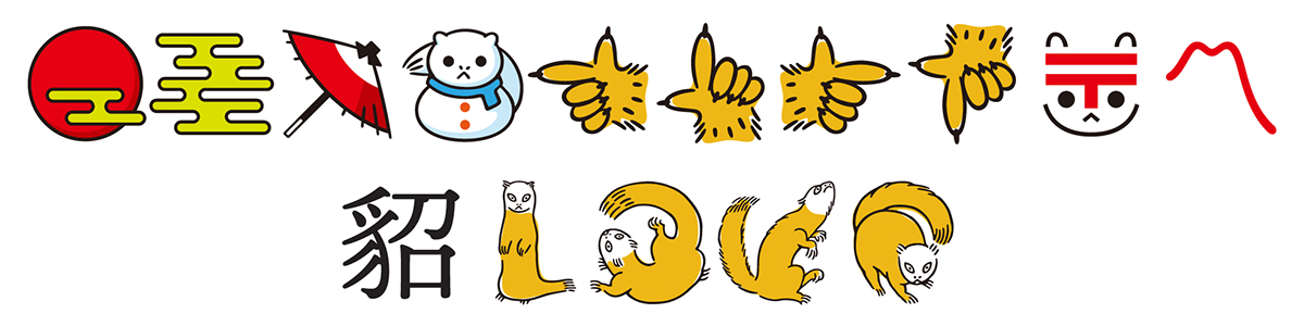
The Black&White version of these glyphs, which are accessible when specifying the 'ss03' (named “Black and White” in English, and 白黒 in Japanese) GSUB feature, or if the fonts are used in environments that do not yet support OpenType SVG fonts, are shown below:
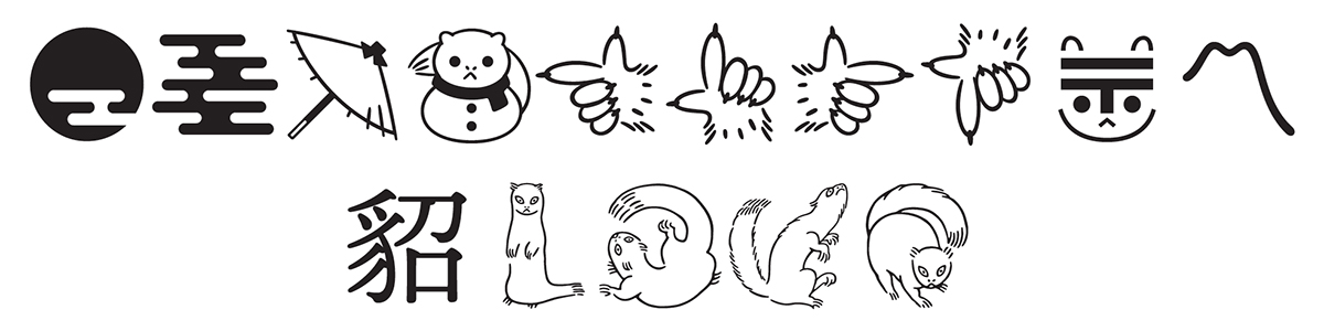
And yes, the incredibly cute marten-shaped alternates of U+8C82 貂 sort of spell out the English word LOVE, and their glyphs are actually in that order in the font resources—this is a hint. My favorite among these special glyphs, whether rendered in color or Black&White, is the one for U+2603 ☃︎, which I affectionately refer to as 雪降り貂ちゃん—this is also a hint.
Unicode Variation Sequences
In order to preserve the representation of the 57 CJK Compatibility Ideographs that are present in the Jinmei-yō Kanji list—and thus supported by Ten Mincho—the appropriate UVSes (Unicode Variation Sequences) are specified in the Format 14 'cmap' subtable, in the form of both Adobe-Japan1 IVSes (Ideographic Variation Sequences) and SVSes (Standardized Variation Sequences). The image below shows the preserved Jinmei-yō Kanji forms followed by the forms of their corresponding base characters:
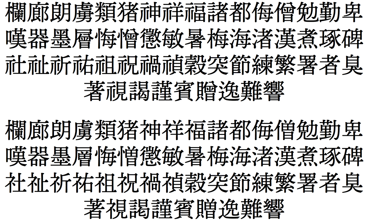
For those who would like to repurpose the “plain text” data for the above, the following can be copied then pasted into apps that support UVSes, or into the dynamic text box on Typekit’s Ten Mincho page:
- 欄󠄀廊󠄁朗󠄀虜󠄀類󠄀猪󠄀神󠄀祥󠄀福󠄁諸󠄀都󠄀侮󠄁僧󠄁勉󠄀勤󠄁卑󠄀嘆󠄀器󠄁墨󠄀層󠄁悔󠄀憎󠄀懲󠄃敏󠄀暑󠄁梅󠄀海󠄀渚󠄀漢󠄁煮󠄀琢󠄀碑󠄀社󠄁祉󠄁祈󠄀祐󠄀祖󠄁祝󠄀禍󠄀禎󠄁穀󠄀突󠄁節󠄁練󠄀繁󠄁署󠄀者󠄁臭󠄁著󠄁視󠄁謁󠄀謹󠄀賓󠄀贈󠄁逸󠄁難󠄀響󠄁—Adobe-Japan1 IVSes
- 欄︀廊︀朗︀虜︀類︀猪︀神︀祥︀福︀諸︀都︀侮︀僧︀勉︀勤︀卑︀嘆︀器︀墨︀層︀悔︀憎︀懲︀敏︀暑︀梅︀海︀渚︀漢︀煮︀琢︀碑︀社︀祉︀祈︀祐︀祖︀祝︀禍︀禎︀穀︀突︀節︀練︁繁︀署︀者︀臭︀著︀視︀謁︀謹︀賓︀贈︀逸︁難︀響︀—SVSes
- 欄廊朗虜類猪神祥福諸都侮僧勉勤卑嘆器墨層悔憎懲敏暑梅海渚漢煮琢碑社祉祈祐祖祝禍禎穀突節練繁署者臭著視謁謹賓贈逸難響—CJK Compatibility Ideographs
- 欄廊朗虜類猪神祥福諸都侮僧勉勤卑嘆器墨層悔憎懲敏暑梅海渚漢煮琢碑社祉祈祐祖祝禍禎穀突節練繁署者臭著視謁謹賓贈逸難響—Base Characters
Adobe-Japan1 IVSes for the remaining kanji, all of which are represented as default UVSes, are included for good measure.
The Ten Mincho glyph set includes slashed forms of U+0030 0 (zero) and U+FF10 0 (full-width zero), and while these glyphs are accessible via the 'zero' GSUB feature, they are also accessible in “plain text” environments using the following SVSes: <U+0030,U+FE00> 0︀ and <U+FF10,U+FE00> 0︀. The former glyph is also available in the Italic face, and is accessible using both means. Like the SVSes for the 57 CJK Compatibility Ideographs above, these two sequences can also be copied then pasted into the dynamic text box on Typekit’s Ten Mincho page.
Also included are EVSes (Emoji Variation Sequences) that allow the user to explicitly specify text– or emoji-style presentation for the following six characters: U+2600 ☀︎, U+2601 ☁︎, U+2602 ☂︎, U+2603 ☃︎, U+261D ☝︎, and U+303D 〽︎. Although the color glyphs cannot yet be used with Ten Mincho—for reasons described in the previous section of this article—the “plain text” below specifies both sequences for these six characters:
☀︎☀️ ☁︎☁️ ☂︎☂️ ☃︎☃️ ☝︎☝️ 〽︎〽️
In closing, I hope that our customers enjoy using Ten Mincho as much as I enjoyed working with our typeface designer, Ryoko Nishizuka (西塚涼子), and her incredibly talented team, and performing the overall production. And, as I wrote at the very beginning of what became a very long article, I also hope that this typeface serves to inspire other type foundries and typeface designers to develop similar typefaces.
Enjoy!