As the readership of this blog should know, I updated the Source Han Sans and Noto Sans CJK fonts to Version 2.001 early last month, mainly to accommodate the glyphs for U+32FF ㋿ SQUARE ERA NAME REIWA, which is the two-ideograph square ligature form of Japan’s new era, Reiwa (令和), that began on 2019-05-01. I then seized the opportunity to update our corporate Adobe Clean Han typeface family, to bring it into alignment with Source Han Sans Version 2.001. The updated Adobe Clean Han fonts are now being served to this blog.
I then decided to embark on a somewhat ambitious project to develop a new open source typeface named Source Han Mono, which is best described as a Pan-CJK version of Source Han Code JP, first developed four years ago by my esteemed colleague in our Tōkyō office, Masataka Hattori (服部正貴). You can read the background here. This effectively closes Issue #2 in the Source Han Code JP project.
Source Han Mono is a derivative typeface design of Source Han Sans, designed by my colleague Ryoko Nishizuka (西塚涼子), and Source Code Pro, designed by my colleague Paul D. Hunt. Its localized names are 源ノ等幅 (Japanese), 본모노 (Korean), 思源等宽 (Simplified Chinese), 思源等寬 (Traditional Chinese—Taiwan), and 思源等寬 香港 (Traditional Chinese—Hong Kong SAR). (As an aside, the reason why the Traditional Chinese—Hong Kong SAR name, 思源等寬 香港, appears correctly is due to the updated Adobe Clean Han fonts. This benefitted the glyphs for U+7B49 等 and U+9999 香.)
This article will detail some of the challenges that I faced, along with some of the decisions that I made, while developing this new Pan-CJK typeface family.
Source Han Mono is deployed only as a 70-font OpenType/CFF Collection (OTC) that supports seven weights—EL (ExtraLight), L (Light), N (Normal), Regular, M (Medium), Bold, and Heavy (H)—five languages—Japanese, Korean, Simplified Chinese, and two flavors of Traditional Chinese (Taiwan and Hong Kong SAR)—and two styles—upright and italic. This deployment format saves approximately 15MB, which is equivalent to a 10-font weight-specific OTC that supports the five languages and two styles. In other words, the size savings is approximately 15%, which is significant. This savings is due to the sharing of large 'sfnt' tables across weights, such as the 'cmap' and 'GSUB' tables.
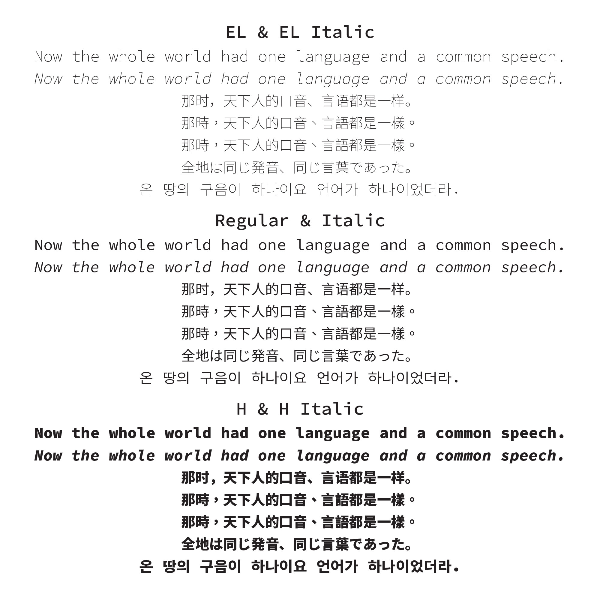
The image below is Genesis 11:1, shown in three of the weights, in all of the supported languages, and in both styles:
Three Horizontal Advances
One of the main guiding principles of Source Han Mono is that all of the glyphs must have one of three possible horizontal advances with no exceptions: 0 (zero), 667, or 1000 units. For kana, ideographs, and full-width symbols, the Source Han Sans glyphs could be used as-is. For the Western glyphs that are proportional, it meant replacing the Source Sans Pro–derived glyphs with Source Code Pro–derived ones. Following in the footsteps of Source Han Code JP, I scaled the Source Code Pro glyphs to 111.2%, which resulted in expanding their horizontal advances from 600 to 667 units.
The glyphs for hangul (한글) letters and syllables, which have 920-unit horizontal advances in Source Han Sans, along with those for half-width katakana (半角片仮名), which have 500-unit horizontal advances, presented an interesting design challenge whose solution will be described later in this article.
Torpedoed Glyphs
Some of the glyphs in Source Han Sans have no purpose being included in Source Han Mono, because they are too wide, too tall, or redundant. The glyphs for U+2E3A ⸺ TWO-EM DASH and U+2E3B ⸻ THREE-EM DASH fall into the first two categories—remember that they include vertical forms that are two- and three-em tall, respectively. The glyphs for U+3031 VERTICAL KANA REPEAT MARK and U+3032 VERTICAL KANA REPEAT WITH VOICED SOUND MARK fall into the second category. The explicit half-width glyphs fall into the third category. Other glyphs were excluded because they have no corresponding glyph in Source Code Pro, specifically U+FB00 ff LATIN SMALL LIGATURE FF, U+FB03 ffi LATIN SMALL LIGATURE FFI, U+FB04 ffl LATIN SMALL LIGATURE FFL, U+1F16A 🅪 RAISED MC SIGN, U+1F16B 🅫 RAISED MD SIGN, and U+1F16C 🅬 RAISED MR SIGN.
In order to make room for several hundred italic glyphs, I decided to remove the glyphs for the 500 high-frequency archaic hangul syllables. These 500 syllables are still supported via combining jamo.
Two Styles, One Glyph Set
Unlike conventional fonts that use a separate glyph set for the Italic style, such as Source Code Pro, Source Han Mono includes the italic glyphs in a unified glyph set. For CJK or Pan-CJK fonts, this makes a lot of sense, because only a small number of glyphs need to be italic, and maintaining separate glyph sets would be comparable to the tail wagging the dog. The upright (non-italic) font instances are able to access the italic glyphs by either selecting the Italic style in apps that support style-linking, or via the 'ital' (Italics) GSUB feature.
In addition, and because all CIDs are precious when developing a Pan-CJK typeface, Western glyphs that do not vary in the Italic style, at least in Source Code Pro, such as for characters that are used for rudimentary math, are excluded from the glyph set. Those characters simply map to the non-italic glyphs in the Italic style. The number of affected Latin characters is 26.
Anisotropic Techniques
Two particular glyph classes presented an interesting challenge, because their glyphs didn’t match one of the three horizontal advances. The hangul letters and syllables, which have 920-unit horizontal advances in Source Han Sans, were one class. Half-width katakana, with 500-unit horizontal advances, were another class. For both glyph classes, I ended up leveraging anisotropic techniques to expand the glyphs for these two glyph classes to 1000 and 667 units, respectively. The animated image below compares text set using Source Han Sans and Source Han Mono, and the second and fourth lines include glyphs that resulted from applying anisotropic techniques:
For the half-width katakana glyphs, only the katakana in the range U+FF66 through U+FF9D were adjusted in this way. The glyphs for the half-width punctuation, parentheses, and annotations were adjusted only by expanding their horizontal advances to 667 units, and repositioning their glyphs along the X-axis as necessary. The glyph for U+FF65 ・ HALFWIDTH KATAKANA MIDDLE DOT in the above image illustrates this point well.
The technique involved first expanding the ExtraLight and Heavy masters to the desired horizontal advance by specifying a transformational matrix via the AFDKO (Adobe Font Development Kit for OpenType) rotatefont tool. The command lines below were used to expand the thousands of hangul letters and syllables from 920 to 1000 units (I needed to first convert the masters into UFOs):
rotatefont -ufo -matrix 1.087 0 0 1 0 0 Hangul_0_920.ufo Hangul_0_1000.ufo

rotatefont -ufo -matrix 1.087 0 0 1 0 0 Hangul_1_920.ufo Hangul_1_1000.ufo
The next step was to create a designspace file that specified two axes, weight ('wght') and width ('wdth') that are defined by the original (920-unit) and expanded (1000-unit) ExtraLight and Heavy masters. I also needed to define two instances that would become the new 1000-unit ExtraLight and Heavy masters, for which the xvalue of the weight axis is adjusted so that the outlines are interpolated at different rates (the yvalue was set to 0 and 1000 for the two instances, respectively), and for which the xvalue of the width axis is set to 1000 for both instances to maintain the desired 1000-unit width throughout the interpolation. I determined that xvalues of −25 (ExtraLight) and 900 (Heavy) gave the desired results for the weight axis. The command line below was used to produce the new ExtraLight and Heavy masters for the hangul letters and syllables:
makeinstancesufo -a -c --ufo-version 2 -d Hangul.designspace
My extraordinarily talented colleague, Miguel Sousa, taught this technique to me, which should be used only for relatively minor adjustments. If the degree to which the glyphs are expanded—or compressed—is too great, the design will begin to degrade.
Slashed Zero
In order to distinguish 0 (zero) from O (uppercase letter), Source Code Pro uses a center dot for the former glyphs. I wrote “glyphs” in the plural, because there are four glyphs for zero with a center dot: upright and italic, of course, but also standard and cap-height versions for both styles. The cap-height glyphs for zero, along with the nine other digits, are default (encoded), and language-tagging the text as English will invoke the standard-height digits. This behavior is identical to Source Han Sans and Source Han Serif.
Oh, right. Source Code Pro also includes slashed forms of the zero glyph, and Source Han Mono therefore includes all four versions, like for the center-dot form. The slashed form is accessible via the aptly-tagged 'zero' (Slashed Zero) GSUB feature.
More Extensive Style Linking
Like Source Han Sans and Source Han Serif, the Source Han Mono font instances are style-linked, but more extensively thanks to the presence of italic glyphs and the separate italic font instances whose 'cmap' tables map to them. The fonts for the former two families style-link only the Regular weight to the Bold weight. For Source Han Mono, all weights are additionally style-linked to the corresponding italic font instance. This is useful in apps that support style-linking via buttons or controls for the Bold and Italic styles.
Source Han & Noto CJK Mega/Ultra OTCs—Updated!
The last time that I updated the Mega OTCs and Ultra OTC was over a year ago, and the release of Source Han Mono gave me a good reason to update the entire project. The Source Han and Noto CJK Mega OTCs now have 143 (was 78) and 73 (was 64) fonts, respectively. The former Mega OTC grew to approximately 400MB (was approximately 300MB). The Ultra OTC that combines the two Mega OTCs now has 216 (was 142) fonts, but is a mere 200K larger than the Source Han Mega OTC due to massive 'sfnt' table sharing between the Source Han and Noto CJK families.
I would like to emphasize that the 216-font Ultra OTC is incredibly size-efficient. The total footprint of its 216 font instances, if they were installed as 216 separate OpenType/CFF fonts, would be nearly 4GB. I can therefore claim that the Ultra OTC deployment format literally decimates the footprint at approximately 400MB. That also means that each 65,535-glyph font instance represents less than 2MB.
Oh, and guess which OTC I currently have installed.
For More Information…
For more information about Source Han Mono, I encourage that you take the time to read the extensive ReadMe (a PDF will download if clicked) that I prepared. Heck, you may even notice that I used Source Han Mono to typeset it.