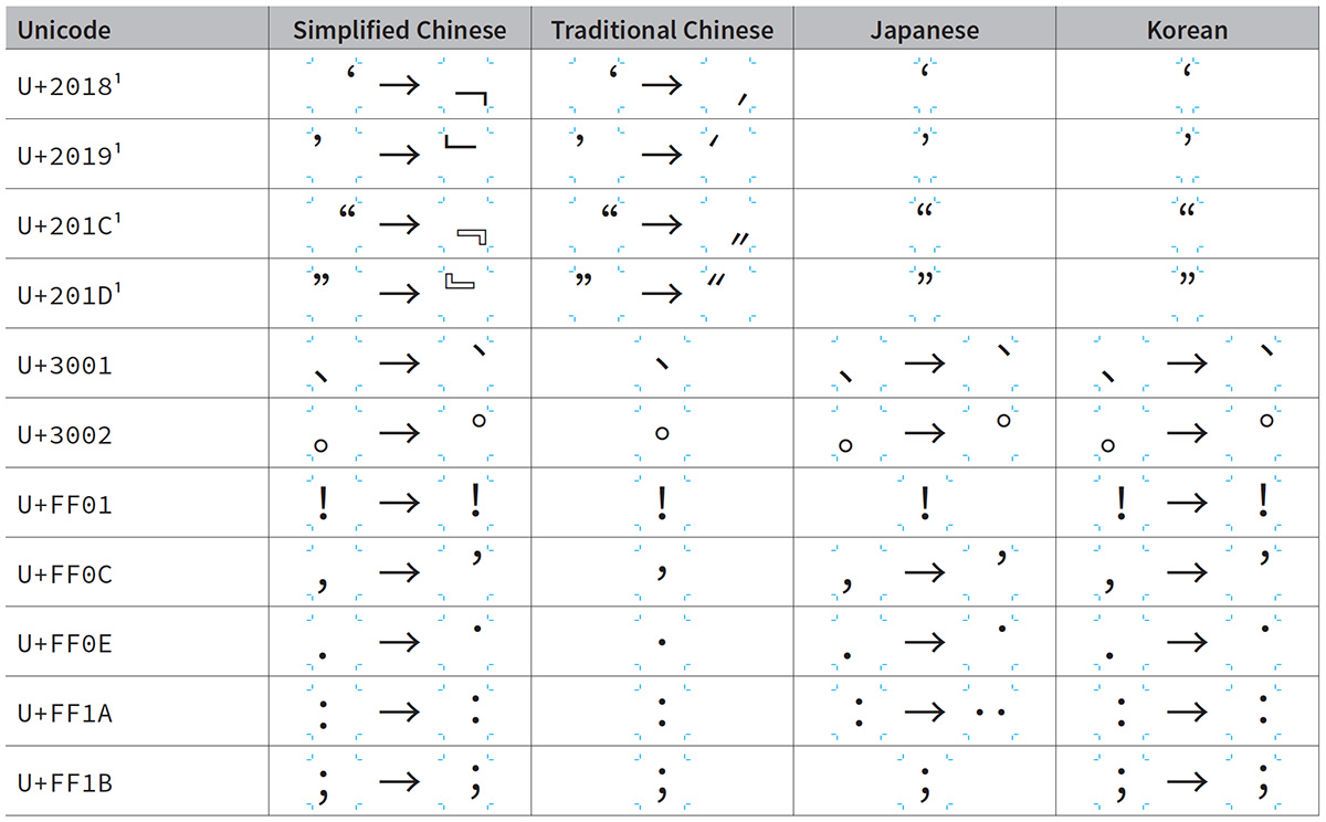
Well, it’s April 1st, which represents an ideal time to release and introduce Adobe Blank 2, which is a new version of the popular Adobe Blank font.
Continue reading…


Well, it’s April 1st, which represents an ideal time to release and introduce Adobe Blank 2, which is a new version of the popular Adobe Blank font.
Continue reading…

In early 2008, as part of writing and typesetting CJKV Information Processing, Second Edition and preparing the latest version of Adobe Tech Note #5078 (The Adobe-Japan1-6 Character Collection), I built a small—in terms of the number of glyphs—special-purpose font for displaying registration marks for glyphs, and named it Tombo. Such registration marks are incredibly useful for showing the relative position of a glyph within its em-box, and for conveying the visual horizontal advance (aka glyph width). The excerpt above shows this font’s use in the Source Han Sans ReadMe (note that the PDF file will download if clicked).
Continue reading…
One of the questions one may ask about the Adobe-branded Source Han Sans and Google-branded Noto Sans CJK open source Pan-CJK typeface families is whether they are GB 18030–compliant. Compliant? Sort of. Certified? Not yet.
Let me explain…
Continue reading…
Let it be known that the “OpenType Collection” (OTC) format was born on 09/21/2011 at Pho Minh Restaurant in Cupertino, California. Present from Adobe were the following: David Lemon, Ken Lunde, Sairus Patel, and Read Roberts. Present from Apple were Antonio Cavedoni, Julio Gonzalez, Yasuo Kida, Peter Lofting, and Tony Tseung. — Adobe & Apple
The above declaration paved the way for supporting (CFF-based) OpenType Collections in Apple’s OS X (beginning from Version 10.8) and in Adobe’s applications (beginning from CS6).
Continue reading…
For those familiar with typeface design, there is no doubt that the Latin and Latin-like glyphs—to include those for Greek and Cyrillic—in Source Han Sans are based on Source Sans Pro. One may also wonder about the half-width Latin glyphs in Source Han Sans and how they compare to those in Source Code Pro. The purpose of this short article is to make these relationships and differences clear, or at least clearer.
Continue reading…

One of the reasons why Source Han Sans—and obviously the Google-branded Noto Sans CJK—can be considered the world’s first Pan-CJK typeface family is due to its support for Korean hangul. While it is common to support modern hangul in Korean fonts, supporting archaic hangul is relatively uncommon. One of the more challenging aspects of developing Source Han Sans was implementing support for archaic hangul, which also included handling 500 high-frequency archaic hangul syllables. This article will thus detail what went into supporting archaic hangul in Source Han Sans. I’d like to once again thank our talented friends at Sandoll Communications for designing the glyphs for these characters.
Continue reading…
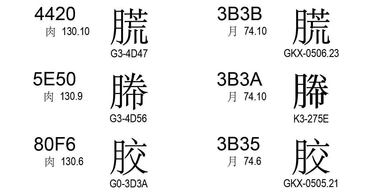
As I described in an article earlier this year, GB 18030 artificially imposes a visual difference between Radicals #74 (⽉) and #130 (⾁) for character pairs that differ only in this component, though conventions for Simplified Chinese use a unified form that looks like Radical #74. In that article I pinpointed a case for which the character that uses Radical #130 is in error, because its left-side radical uses the Radical #74 form, and the corresponding character that uses Radical #74 is outside the scope of GB 18030 (at least for now).
Thanks to Jaemin Chung, I was able to find three errors within the scope of GB 18030, as shown below:

According to the principles imposed by GB 18030, the characters on the left are in error, and should be visually distinct from those on the right in terms of their left-side radical.
Continue reading…

For the first time in my life, I visited three East Asian countries in a single trip: China, South Korea, and Japan. I have had trips that involved two countries—South Korea & Japan, China & South Korea—but never three. This particular one was also done in the span of only one week.
The purpose of this trip was to visit the three type foundries who were involved in the Source Han Sans/Noto Sans CJK project: Changzhou SinoType (常州华文) in Changzhou, China; Iwata (イワタ) in Tōkyō, Japan; and Sandoll Communications (산돌커뮤니케이션) in Seoul, South Korea. In addition to thanking each company in person, we also used the opportunity to discuss particulars of the project, in terms of what worked well and what didn’t, and I also demonstrated the processes that I used to take their raw glyph data and turn it into the final fonts. All three companies gave us a warm welcome, and were very gracious hosts. We had excellent lunches and dinners with all three companies, which allowed for greater social interaction.
Masataka HATTORI (服部正貴) from our Tōkyō office traveled with me to China and South Korea, and Jinho KANG from our Seoul office participated in the meeting with Sandoll Communications. In addition to Masataka, Taro YAMAMOTO (山本太郎) participated in the meeting with Iwata.
Continue reading…

This week’s festivities have thus far included attending IUC38 in Santa Clara, California. I presented twice, both times about Source Han Sans and Noto Sans CJK development.
For those who were unable to attend this excellent conference, the slides for my two presentations, Developing & Deploying The World’s First Open Source Pan-CJK Typeface Family and Building Source Han Sans & Noto Sans CJK, are now available.
Enjoy!
P.S. The image shown above, which was used on page 47 of my first presentation to describe the Super OTC deployment configuration, became popular during IUC38, and was used by at least three other presentations. ☺
Unless you have been living in a cave or under a rock, you’ve no doubt heard of Source Han Sans or Noto Sans CJK through the initial announcements from Adobe or Google who jointly developed them, or elsewhere. These two Pan-CJK typeface families, which are joined at the hip because they differ only in name, were released to the world at large, as open source fonts, on the afternoon of July 15, 2014 in the US, which was the morning of July 16, 2014 in East Asia, their target audience. Click on the preview below to view a single-page PDF that shows all 65,535 glyphs from one of these fonts:
Over the next several months I plan to publish a series of articles on this blog that will detail various aspects of the development process that I employed for building these two typeface families. Although the subsequent articles will mention only Source Han Sans by name, they also pertain to its twin, Noto Sans CJK.
Continue reading…