Posts in Category "Type"

NHK World: Design Talks

[I’d like to preface this article by stating that it was written and contributed by our esteemed colleague, Taro YAMAMOTO (山本太郎), who manages our Japanese typeface design efforts in our Tokyo office. — KL]

NHKワールドでは、ロンドン時間で6月13日(木)1:30–2:00の番組『Design Talks』で、日本語タイポグラフィを取り上げる。ひらがな、カタカナ、漢字、ローマ字など種々の異なる種類の文字が用いられる現代の日本語タイポグラフィは、手書きの時代に築かれた、多彩な芸術的な成果とも深く関係している。この番組では、書体デザイナーに取材することで、日本語タイポグラフィの特質を明らかにする。

この番組についてはこのリンクを参照してください(番組のスケジュールや視聴方法については、上記URLのページにあるリンクをご覧ください)。

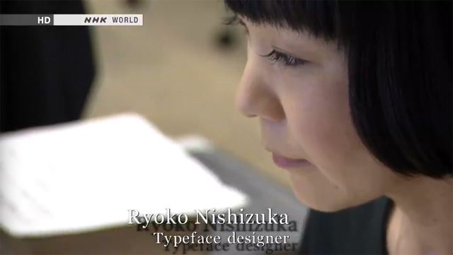
NHK World’s TV program, Design Talks, to be broadcast from 1:30 to 2AM on Thursday, June 13th (UTC, London Time), will feature Japanese typography and typeface design. Various kinds of characters, such as Chinese ideographs, Japanese hiragana and katakana syllables, as well as Latin alphabet characters are used in Japanese typography, and it has a deep relationship with the tradition of Japanese calligraphy and handwriting, which were artistically made, and represent a culmination from the past. This program tries to shed light on the unique characteristics of Japanese typography by interviewing talented type designers of today, one of whom is Adobe’s own Ryoko NISHIZUKA (西塚涼子).

Ryoko Nishizuka

Kazuraki

Kazuraki

For more information about the TV Program: Design Talks (please refer to the links on that page to find out the program schedule and how to watch the program).

[For those in the US, you can check the schedule to find out when this program will be broadcasted. The easiest way to watch the program is by using the “NOW ON AIR” pod in the upper-right corner of the main page. For those in the PDT time zone, such as California, it will be broadcasted at 6:30PM and 10:30PM on Wednesday, June 12th, and at 2:30AM, 6:30AM, 10:30AM, and 2:30PM on Thursday, June 13th. — KL]

Gothic/Myungjo or Dotum/Batang?

The prototypical Serif and Sans Serif typeface style distinction in Korean has traditionally used the names Myeongjo (명조체/明朝體 myeongjoche) and Gothic (고딕체/고딕體 godikche), respectively. But, in 1993, the Republic of Korea (South Korea) Ministry of Culture, in an attempt to standardize typographic terms, recommended the use of Batang (바탕 batang) and Dotum (돋움 dotum) as the proper names for these two typeface styles.

At the time the Ministry of Culture recommendation was made, which was a period when printing was the most common use of fonts, Batang was meant for body text, and Dotum was for display or emphasis purposes. Mobile devices have provided a new use for Dotum, because its lack of serifs provided superior readability on mobile devices with smaller screens that necessitated smaller point sizes, and the original rationale for these new names seems to no longer apply.

From what I can tell, Korean type foundries have not embraced the Batang and Dotum names, and have actually resisted their use. What probably didn’t help was the fact that Microsoft released TrueType fonts with these exact names, with no additional qualifiers: Batang and Dotum. In other words, it seems that Microsoft’s use of these names polluted their chance at more widespread use, because they were treated as typeface names, not typeface style names.

In closing this brief article, I am curious about what our blog readership thinks about this particular issue. I welcome any and all comments.

Heisei “StdN” Fonts

We recently released alternate versions of two Heisei (平成) fonts, specifically Heisei Mincho StdN W3 (平成明朝 StdN W3) and Heisei Kaku Gothic StdN W5 (平成角ゴシック StdN W5). As the “StdN” designator suggests, JIS2004 glyphs are the default for these two fonts (the Heisei “Std” fonts use JIS90 glyphs by default).

These two fonts also differ from the Heisei “Std” fonts in that they include significantly more glyphs. The Heisei fonts were developed by a consortium of companies, and Adobe is one of the member companies. Interestingly, JIS X 0213:2004 glyph data was developed only for Heisei Mincho W3 and Heisei Kaku Gothic W5, and JIS X 0212-1990 glyph data was developed only for the former font. So, one of my projects last year was to map as many of these glyphs as possible to Adobe-Japan1-6 CIDs.
Continue reading…

Adobe Blank: Another Adobe-Identity-0 Implementation

As I wrote nearly a year ago, the Adobe-Identity-0 ROS is useful for building special-purpose fonts, especially CJK ones whose glyph coverage does not match one of our public ROSes. Our latest Adobe-Identity-0 ROS font is the open-source Adobe Blank, whose purposes and implementation details are described on our sister blog, Typblography.

Thank you to all our Chinese and Japanese community translators

In the past few months we’ve had a lot of activity by the Chinese and Japanese communities on our Community Translation project (over 100 accepted translations). We are very pleased to see all of this activity and want to publicly thank the following five individuals:

Ying Ning
Tonny Xu
Vincent Ding
Hai Liang
Takesato Hayashi

Without them, and all of the other individuals we mentioned in previous posts, this program would not be a success.

To learn more about the Adobe Type Community Translation program, refer to Typblography project page. If you have any questions or requests related to the Type Community Translation program feel free to reach out to us at type-translations@adobe.com.

Announcing Source Code Pro

Following again in the tradition of Adobe’s first open source font, Kenten Generic, the Adobe Type team announced today the release of their second open source typeface family, Source Code Pro. This monospaced typeface family was designed by our team’s own type designer Paul Hunt, who based the work on Source Sans Pro, Adobe’s first open source typeface family, released just last month. Six weights of Source Code Pro, along with its source files, can be download from the Open@Adobe portal on SourceForge, and for those who want to clone and fork the project, please refer to the GitHub location. The fonts are also available for Web use through Typekit, WebINK, and Google Web Fonts.

To learn more about the inspiration behind Source Code Pro, and how its design was adapted from Source Sans Pro, please refer to Paul Hunt’s Typblography article.

Adobe Type Community Translation

Today the Adobe Type team launched a new pilot program for Community Translation. This program is aimed at getting translations for Adobe’s typeface notes and will reward contributors with free fonts. The team will be using an internal Adobe tool, the Adobe Translator application, to get translations for their 400+ typeface notes (also referred to as typeface histories). These typeface notes provide users additional information about the typeface and often include information about the history of the typeface. On average, these typeface notes are about 100 words in length. Continue reading…

Adobe’s First Open Source Font: Kenten Generic

Hoping not to detract from the attention that Paul Hunt‘s Source Sans Pro, Adobe’s first open source typeface family, deserves, I’d like to use this opportunity to point out that another font, a single typeface design with a very small number of glyphs, was Adobe’s first entry in the open source world, in terms of font offerings. Kenten Generic was released on November 4th, 2010 at the Open @ Adobe portal. It includes only thirteen glyphs—ten of which are functional—that are intended for use in typesetting emphasis marks, which are referred to as kenten (圏点) in Japanese, hence the font’s name. The easiest way to view its glyphs is to download its Unicode-based glyph synopsis.
Continue reading…

Hong Kong or Bust!

I just received good news, in the form of confirmation that both of my ATypI Hong Kong 2012 presentation abstracts were accepted, which means that I will definitely be attending this conference. I alluded to this in the March 30th, 2012 CJK Type Blog article. One of the abstracts is for a 30-minute presentation entitled Kazuraki: Under The Hood, which will immediately follow a 30-minute presentation entitled Kazuraki: Its Art & Design, that will be presented by my colleagues Taro Yamamoto (山本太郎) and Ryoko Nishizuka (西塚涼子). For those who are not aware, Ryoko is the typeface designer of Kazuraki (かづらき), which is the centerpiece of both 30-minute presentations. The other is for a three-hour workshop entitled Manipulating CID-keyed Fonts Using AFDKO Tools, which will be co-presented by my colleague Masataka Hattori (服部正貴).

I am very much looking forward to attending an ATypI conference for the first time, and meeting many people. If you are planning to attend ATypI Hong Kong 2012, please be sure to introduce yourself to me, in case I don’t introduce myself to you first.

Making “Character Codes” Look Better

In my work, I need to deal with character codes on a regular basis, such as Unicode scalar values and hexadecimal values for legacy encodings. This includes writing documents that include them. For most purposes, especially when used in tables, tabular figures work best because they are monospaced. Of course, one could simply choose to use a monospaced font. But, unless a different font is actually desired for character codes, using the same typeface design is usually preferred, because it better matches the surrounding text. The issue is that very few, if any, fonts include tabular glyphs that support hexadecimal notation, specifically referring to ‘A’ through ‘F’ (or ‘a’ through ‘f’ for lowercase). Luckily, I was able to solve this particular dilemma.
Continue reading…