Posts in Category "Building Fonts"

“Tally Marks” OpenType-SVG Font

As a follow up to my Ideographic Tally Marks article from over two years ago, the characters for two tally mark systems—ideographic (called 正の字 sei-no ji in Japanese, and 正字 zhèng zì in Chinese) and Western-style—are among the 684 new characters in Unicode Version 11.0 that was released exactly a week ago, and these seven new characters can be found in the existing Counting Rod Numerals block from U+1D372 through U+1D378.
Continue reading…

The Adobe-KR-9 Character Collection—Beta Release

I am pleased to announce that the Adobe-KR-9 character collection, which went through four drafts, is now available as a Beta release that includes all of the expected collateral pieces, to include two fully-functional OpenType fonts with all of its glyphs. The Adobe-KR-9 project includes the specification proper, along with most of the collateral pieces. The two OpenType fonts are available for convenient download on the latest release page.

The CMap resources are also available in the CMap Resources project, and an updated UTF-32.pdf file that includes a Unicode-based glyph synopsis for the Adobe-KR-9 character collection is available on the latest release page.
Continue reading…

Contextual Spacing GPOS Features: ‘cspc’ & ‘vcsp’

Japanese line layout is very complex, and the first attempt to standardize its rules and principles was in the JIS X 4051 standard, which was first issued in 1993 with the title 日本語文書の行組版方法 (Line Composition Rules for Japanese Documents in English). There was a revision issued in 1995, and the latest version was issued in 2004 with the slightly different title 日本語文書の組版方法 (Formatting rules for Japanese documents). Another important document is the W3C Working Group Note JLREQ (Requirements for Japanese Text Layout), which provides much of what is described in JIS X 4051, but covers additional areas, and is tailored toward web technologies. Although still considered working drafts, W3C is also preparing similar documents for Chinese and Korean as CLREQ (Requirements for Chinese Text Layout) and KLREQ (Requirements for Hangul Text Layout and Typography), respectively.

This article is not about these standards per se, which are intended for apps and environments that implement sophisticated line layout. Rather, this article is about harsher “plain text” or comparable environments that generally do not need such treatment, yet still benefit from a modest amount of context-based spacing adjustment, particularly to get rid of unwanted space between full-width brackets and other punctuation whose glyphs generally fill half of the em-box. App menus, app dialogs, and simple text editors are examples of where such adjustments can improve text layout in these modest ways.
Continue reading…

CMap Resources & Character Collections

The CMap resources that are associated with our public glyph sets—called character collections—were first open-sourced on 2009-09-21 via Adobe’s first open source portal, and about a year later the project was moved to SourceForge. I then migrated the project to GitHub on 2015-03-27 where it is likely to remain for the foreseeable future. The main purpose for open-sourcing our CMap resources was to make it easier for developers to include them in their own open source projects, many of which require that the components themselves be open source.

I then open-sourced three of our four character collections on GitHub—Adobe-GB1-5, Adobe-CNS1-7, and Adobe-Japan1-6—in October of last year. The Adobe-Korea1-2 character collection was intentionally not open-sourced, because it will soon be replaced by the Adobe-KR-9 character collection that is expected to be published in mid-May.
Continue reading…

Adobe-KR-9 Fourth Draft

This article picks up where the 2018-01-18 article left off, and provides details about the fourth—and hopefully final—draft of the forthcoming Adobe-KR-9 character collection that was issued today.

The fourth draft of the Adobe-KR-9 character collection includes 22,860 glyphs (CIDs 0 through 22859) distributed among ten Supplements. When compared to the third draft, four glyphs were removed, only one glyph was added, a small number of glyphs were moved from Supplement 0 to later Supplements, and the ordering of Supplements 3 through 9 was changed. Because it is a draft, the details are still subject to change, though my hope is that this draft represents what will become the final character collection specification.
Continue reading…

Standardized Variation Sequences—Part 1

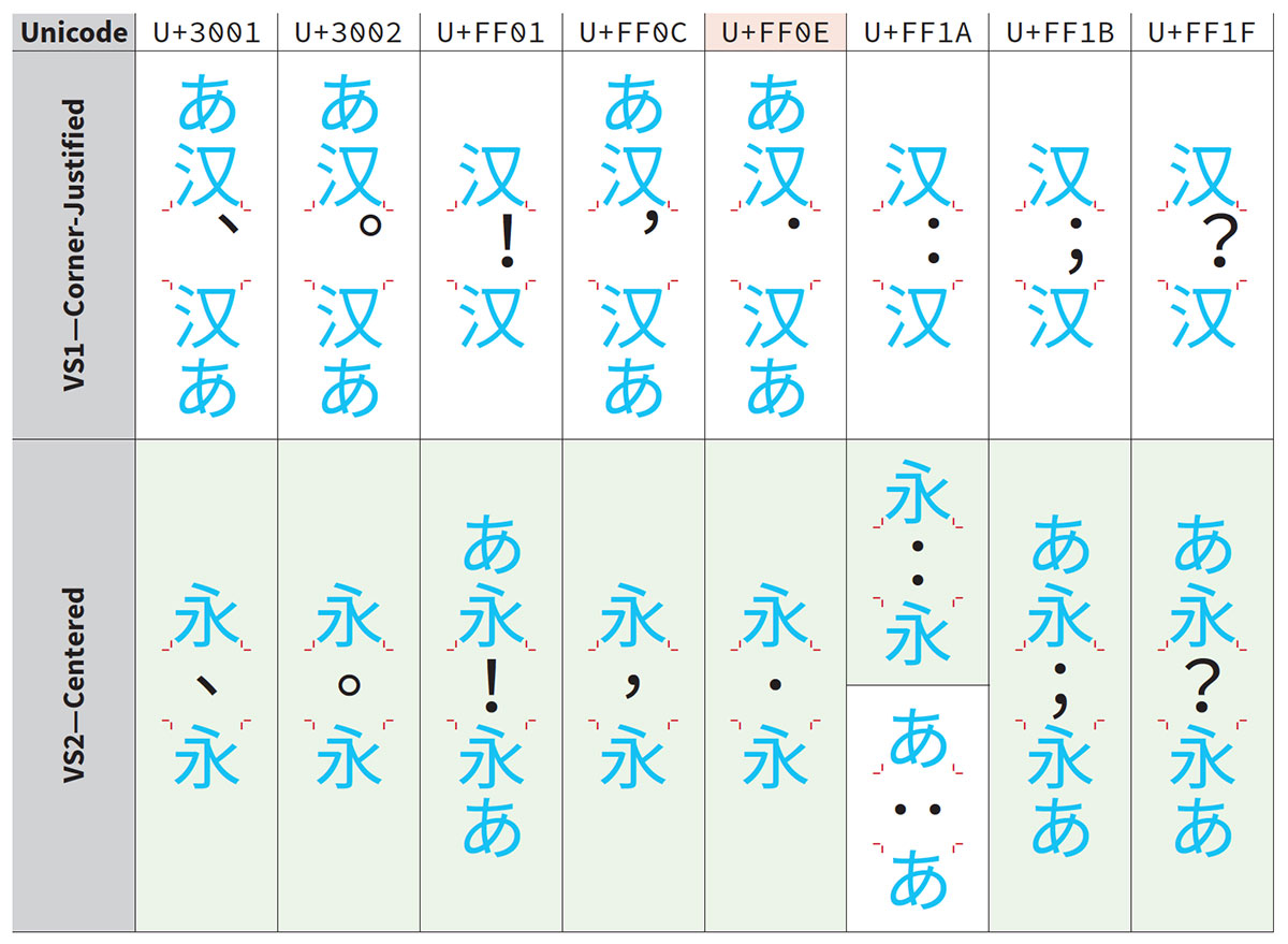
This is a brief article to report that the 16 SVSes (Standardized Variation Sequences) for eight full-width punctuation characters—U+3001 、 IDEOGRAPHIC COMMA, U+3002 。 IDEOGRAPHIC FULL STOP, U+FF01 ! FULLWIDTH EXCLAMATION MARK, U+FF0C , FULLWIDTH COMMA, U+FF0C , FULLWIDTH COMMA, U+FF1A : FULLWIDTH COLON, U+FF1B ; FULLWIDTH SEMICOLON & U+FF1F ? FULLWIDTH QUESTION MARK—that I proposed in L2/17-436 were accepted for Unicode Version 12.0 during UTC #154 this week. After reading the Script Ad Hoc group’s comments, I prepared a revised version (L2/17-436R) that provided additional information as a response to the two comments, which included the table that is shown above, and this served as the basis for the discussions.

This all began with a proposal that I submitted four years ago, L2/14-006, which was resurrected as L2/17-056, and finally discussed during UTC #153 during which I received constructive feedback. This prompted me to split the proposal into two parts. The first part proposed the less-controversial SVSes, which are the ones that were accepted. The second part, L2/18-013, proposes the more controversial ones. I am fully expecting to revise the second part before it is discussed during UTC #155, which begins on 2018-04-30.

I would like to use this opportunity to solicit comments and feedback for L2/18-013, which would be taken into account when I revise it. (I also hope to receive feedback from the Script Ad Hoc group prior to UTC #155, which would also be taken into account.)

In closing, the 16 new SVSes should soon appear in The Pipeline.

🐡

Adobe-KR-9 Third Draft

This article picks up where the 2017-12-19 article left off, and provides details about the third draft of the forthcoming Adobe-KR-9 character collection that was issued today.

The third draft of the Adobe-KR-9 character collection includes 22,863 glyphs (CIDs 0 through 22862) distributed among ten Supplements. When compared to the second draft, three glyphs were removed, 254 glyphs were added, and the distribution of glyphs among some of the Supplements was changed. Because it is a draft, the details are still subject to change, though I suspect that any changes will be minimal at this point.
Continue reading…

Adobe-KR-9 Second Draft

This article picks up where the 2017-10-01 article left off, and provides details about the second draft of the forthcoming Adobe-KR-9 character collection that was issued today.

The second draft of the Adobe-KR-9 character collection includes 22,612 glyphs (CIDs 0 through 22611) distributed among ten Supplements. When compared to the first draft, 35 glyphs were removed, ten glyphs were added, three Supplements were added, and the distribution of glyphs among some of the Supplements was changed. Because it is the second draft, the details are still subject to change—and most certainly will change, though I hope that the changes are minimal.
Continue reading…

「貂明朝」は日本語フォントの新たな領域へ


(この記事中の貂の写真はすべて Adobe Stock で見つけることができます)

English (英語) here

この記事の目的は、Typekit から提供される「明朝」(Ten Mincho) の書体とフォント開発について技術的詳細を説明することにあります。貂明朝は、これまでどんな日本語フォントも到達しなかった領域に足を踏み入れました。貂明朝の書体デザインについての詳細については、Typekit Blog 上の公式アナウンスメント (英語) の方をご覧ください。この長文の技術的な記事よりも、そちらの方に興味を持たれるかもしれません。公式アナウンスメントに述べられているように、この新しい Adobe Originals の和文書体にはユニークな特長が数多くあります。そのため、日本や各国の書体メーカー、タイプデザイナーの方々はこの書体からインスピレーションを受けられることでしょう。


Continue reading…

Ten Mincho: To Boldly Go Where No Font Has Gone Before


(All of the marten photos that are used in this article can be found on Adobe Stock)

日本語 (Japanese) はこちら

The purpose of this article is to provide technical details of how the Ten Mincho明朝 in Japanese—typeface and its fonts, which are initially being offered as a Typekit exclusive, were developed, and how they boldly go where no Japanese font has gone before. For more details about the Ten Mincho typeface design itself, which is probably much more interesting than this really long and technical article, I encourage you to read the official announcement (日本語) on the Typekit Blog. As stated in the official announcement, this new Adobe Originals Japanese typeface is unique in many ways, and should serve as inspiration for type foundries and typeface designers in Japan and elsewhere.


Continue reading…