Posts in Category "Open Source"

Source Han Unicode

One of my hobbies is apparently to explore various ways to stress-test Adobe products, and the target of today’s article happens to be recent adventures with Adobe InDesign and our Source Han families.

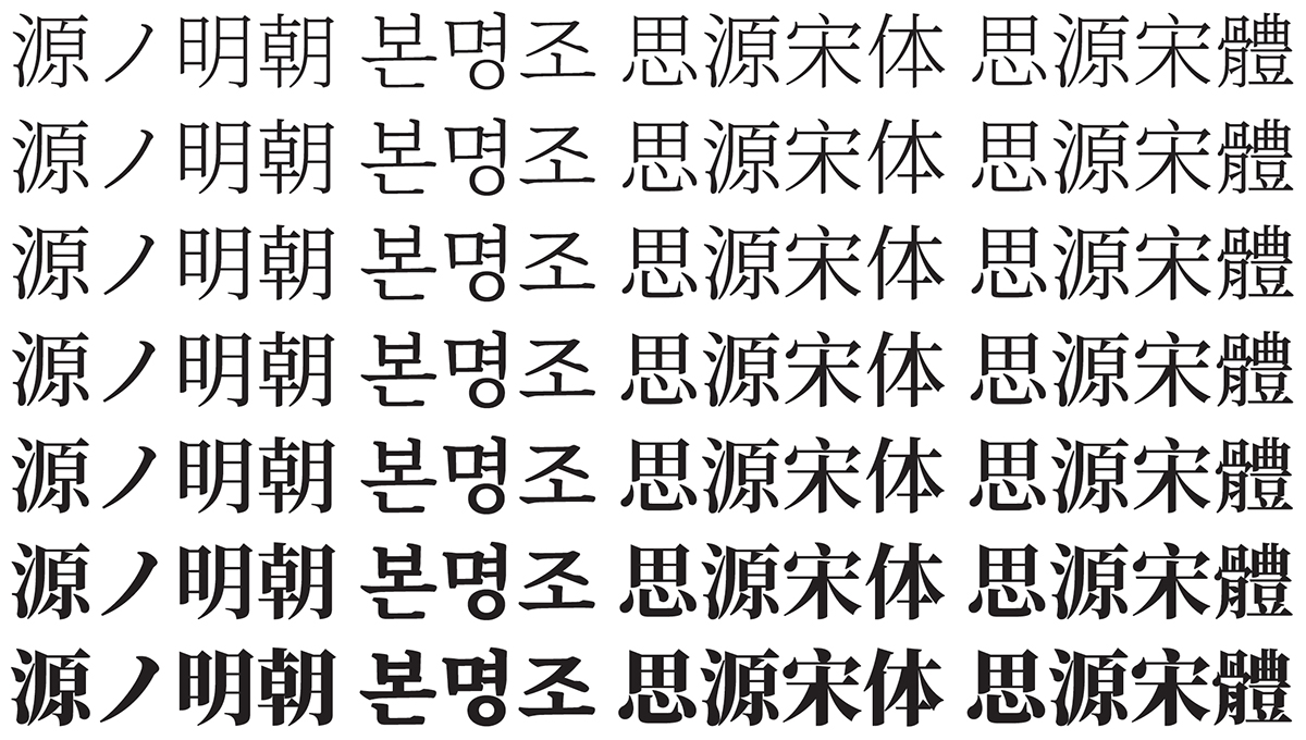
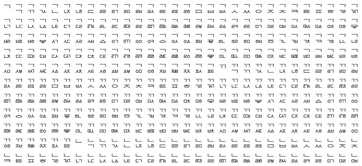
The background is that I produced Unicode-based glyph synopses as part of the Source Han Sans and Source Han Serif releases, but those PDFs show only up to 256 code points per page, and it takes several hundred pages to show their complete Unicode coverage. I also produced single-page PDFs that show all 65,535 glyphs. A Source Han Sans one is available here, and a Source Han Serif one is available here. However, they are not Unicode-based.
Continue reading…

Source Han Sans vs Source Han Serif

At seemingly every opportunity, whether via this blog or during public speaking engagements, I have made it abundantly clear that the Adobe-branded Source Han families share the same glyph set as the corresponding Google-branded Noto CJK families. That is simply because it is true. What requires a bit of explanation, however, is how the two typeface designs—Source Han Sans and Source Han Serif—differ. That is what this particular article is about.

As the Project Architect of these Pan-CJK typeface families, I have my fingers on all of the data that was used during their development, and for preparing each release. I can therefore impart some useful tidbits of information that cannot be found elsewhere.
Continue reading…

Three Multiple-Family Super OTCs

To take the previous article further—and because I tend to have an urge to stress-test environments—I added two more Super OTCs to the Source Han Super OTC open source project this morning.
Continue reading…

Introducing Source Han Super OTC

The release of Source Han Serif earlier this month, on 2017-04-03, gave me an opportunity to build yet another resource for stress-testing environments, particularly those that consume OpenType/CFF Collections. (This also continues to simplify file management by combining three Super OTCs into a much larger one.)
Continue reading…

Designing & Implementing Biáng

Besides being the world’s first open source serif-style Pan-CJK typeface families, the Adobe-branded Source Han Serif and the Google-branded Noto Serif CJK also represent the first broad deployment of two highly-complex and related ideographs that are in the process of being encoded. Their glyphs are shown above in all seven weights. Although it may be hard to believe, the fourth line illustrates the simplified version.
Continue reading…

Source Han Serif / Noto Serif CJK History & Development

Or, perhaps more accurately, the project that has been keeping me busy for the past couple of years.

The Adobe-branded Source Han Serif (named 源ノ明朝 in Japanese, 본명조 in Korean, 思源宋体 in Simplified Chinese, and 思源宋體 in Traditional Chinese) and Google-branded Noto Serif CJK open source Pan-CJK typeface families, which represent the serif-style counterparts to the similarly-named and also open source Source Han Sans and Noto Sans CJK Pan-CJK typeface families, were released on 2017-04-03. You can read more about the Source Han Serif release here (日本語한국어简体中文繁體中文), which includes a six-minute promotional video.

This article provides information that you would not expect to find in the official announcements for Source Han Serif or Noto Serif CJK, mainly because such information is intended for a completely different audience, which is primarily comprised of font developers.

Unless noted otherwise, all further references to Source Han Serif or Source Han Sans will apply to Noto Serif CJK or Noto Sans CJK, respectively.
Continue reading…

To GPOS, Or Not To GPOS

I will open this article by stating that OpenType features are almost always GSUB (Glyph SUBstitution) or GPOS (Glyph POSitioning). The former table specifies features that substitute glyphs with other glyphs, usually in a 1:1 fashion, but not always. The latter table specifies features that alter the metrics of glyphs, or the inter-glyph metrics (aka kerning).

The focus of this particular article will be the 'vert' (Vertical Alternates) feature, which substitutes a glyph with the appropriate glyph for vertical writing, and is invoked when in vertical writing mode. In other words, it’s a GSUB feature, and one that needs to be invoked for proper vertical writing. Current implementations that support the 'vert' GSUB feature, which tend to be CJK fonts, substitute glyphs with their vertical forms on a 1:1 basis, though language-tagging may affect the outcome for Pan-CJK fonts, such as the Adobe-branded Source Han Sans and the Google-branded Noto Sans CJK, which support multiple languages.
Continue reading…

Tales from the “Green Book” — ehandler.ps

Please pardon the apparent non-CJK interruption in the form of this particular article, but I wanted to bring to the readership’s attention a new open source project that has a very long history: ehandler.ps.
Continue reading…

Combining Jamo Test #3

Unlike the first and second similarly-titled articles that I published last month, this article will focus on a minor efficiency for the combining jamo feature of the Adobe-branded Source Han Sans and Google-branded Noto Sans CJK Pan-CJK typeface families.
Continue reading…

Tofu, Or Not Tofu

One of my more popular open source fonts is Adobe Blank, and to a less extent the related Adobe Blank 2 because it uses a 'cmap' table format, Format 13, that is not broadly supported. Actually, Adobe Blank provides absolutely nothing, because it maps all 1,111,998 Unicode code points to a range of 2,048 non-spacing and non-marking glyphs, yet such a font is useful for particular scenarios, such as addressing the FOUT (Flash Of Unstyled Text) problem.

Allow me to introduce Adobe NotDef, which is modeled after Adobe Blank in that it covers all of Unicode and maps to a range of 2,048 glyphs, but differs in that the functional glyphs are spacing and marking. The original suggestion for Adobe NotDef came from Dave Crossland. The glyphs match the shape and advance width of the standard Adobe .notdef glyph that is invoked in environments that do not support font fallback when the selected font does not include a glyph for a particular character, and as Dave wrote, Adobe NotDef is useful for font fallback purposes in that it can be used to prevent the display of non-standard .notdef glyphs that may be present in some fonts in the font fallback chain.
Continue reading…