Some initial Adobe-Japan1-6 versus UTR #50 thoughts…

UTC (Unicode Technical Committee) Meeting #136 took place last week, and one of the significant outcomes was that UTR (Unicode Technical Report) #50 was advanced from Draft to Approved status. Congratulations to Koji ISHII (石井宏治), its editor, and also to Eric Muller, who took the initiative to start this project and served as its first editor.
Continue reading…

The Adobe-Identity-0 ROS & Heuristics

I have advocated the use of the special-purpose and language-neutral Adobe-Identity-0 ROS over the past few years, and have developed several CID-keyed fonts that take advantage of this ROS, but keep in mind that its use can act like a double-edge sword.

On one hand, it provides font developers with great flexibility, in terms of the glyph complement of a font. In other words, font developers need not be restricted to one of our public CJK ROSes, such as Adobe-Japan1-6, or a subset thereof. Kazuraki is an example of a Japanese font whose glyph set requirements didn’t fit Adobe-Japan1-6, so the Adobe-Identity-0 ROS was used.

On the other hand, font developers need to develop all of the necessary resources, such as the UTF-32 CMap Resource that is used as the basis of the ‘cmap‘ table, which maps Unicode code points to glyphs in the font, along with any GSUB features. In addition, and because the Adobe-Identity-0 ROS is language-neutral in that its designation does not specify or suggest a primary language, some applications may incorrectly assign a primary language to such fonts. This, of course, is due to heuristics (発見的教授法 in Japanese), or more specifically, their failure.
Continue reading…

Font Development Via Unicode

Unicode has become the de facto way in which to represent text in digital form, and for good reason: its character set covers the vast majority of the world’s scripts. Other benefits of Unicode include the following:

  • That it is under active and continuous development, meaning that with each new version, more scripts are being supported, and additional characters for existing scripts are being standardized.
  • That it is aligned and kept in sync with ISO/IEC 10646 (available at no charge), which is quite a feat.

With regard to font development, Unicode is considered the default encoding for OpenType, which refers to the ‘cmap‘ table. The most common ‘cmap’ subtables are Formats 4 (BMP-only UTF-16) and 12 (UTF-32). The latter is used only when mappings outside of the BMP (Basic Multilingual Plane), meaning from one or more of the 16 Supplementary Planes, are used.
Continue reading…

NHK World: Design Talks

[I’d like to preface this article by stating that it was written and contributed by our esteemed colleague, Taro YAMAMOTO (山本太郎), who manages our Japanese typeface design efforts in our Tokyo office. — KL]

NHKワールドでは、ロンドン時間で6月13日(木)1:30–2:00の番組『Design Talks』で、日本語タイポグラフィを取り上げる。ひらがな、カタカナ、漢字、ローマ字など種々の異なる種類の文字が用いられる現代の日本語タイポグラフィは、手書きの時代に築かれた、多彩な芸術的な成果とも深く関係している。この番組では、書体デザイナーに取材することで、日本語タイポグラフィの特質を明らかにする。

この番組についてはこのリンクを参照してください(番組のスケジュールや視聴方法については、上記URLのページにあるリンクをご覧ください)。

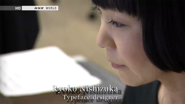
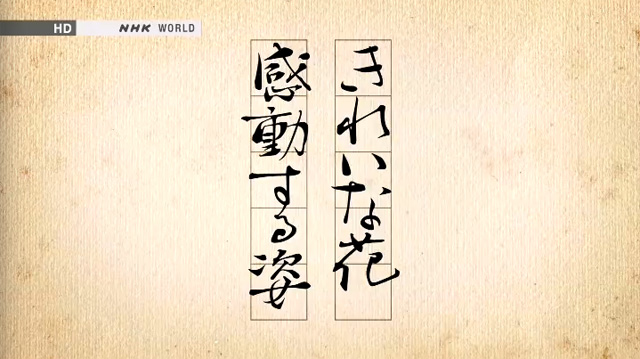
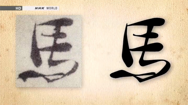
NHK World’s TV program, Design Talks, to be broadcast from 1:30 to 2AM on Thursday, June 13th (UTC, London Time), will feature Japanese typography and typeface design. Various kinds of characters, such as Chinese ideographs, Japanese hiragana and katakana syllables, as well as Latin alphabet characters are used in Japanese typography, and it has a deep relationship with the tradition of Japanese calligraphy and handwriting, which were artistically made, and represent a culmination from the past. This program tries to shed light on the unique characteristics of Japanese typography by interviewing talented type designers of today, one of whom is Adobe’s own Ryoko NISHIZUKA (西塚涼子).

Ryoko Nishizuka

Kazuraki

Kazuraki

For more information about the TV Program: Design Talks (please refer to the links on that page to find out the program schedule and how to watch the program).

[For those in the US, you can check the schedule to find out when this program will be broadcasted. The easiest way to watch the program is by using the “NOW ON AIR” pod in the upper-right corner of the main page. For those in the PDT time zone, such as California, it will be broadcasted at 6:30PM and 10:30PM on Wednesday, June 12th, and at 2:30AM, 6:30AM, 10:30AM, and 2:30PM on Thursday, June 13th. — KL]

「CSS Orientation Test OpenType Fonts」について

[This Japanese version of the May 31, 2013 article entitled CSS Orientation Test OpenType Fonts is courtesy of Hitomi Kudo (工藤仁美).]

五月三十一日にアドビの新しいオープンソースプロジェクトで、「CSS Orientation Test OpenType Fonts」をリリースしたのでお知らせします。このオープンソースプロジェクトは、Unicodeの次期UTR #50(「Unicode Vertical Text Layout」)のエディタである石井宏治氏のリクエストをもとに開発された、二つのOpenType/CFFフォントを含みます。これらフォントの目的は、フォント開発者がより簡単にグリフの方向に関するテストを行えるよう考慮したものです。
Continue reading…

CSS Orientation Test OpenType Fonts

I am pleased to announce that the new CSS Orientation Test OpenType Fonts open source project was launched on Adobe’s open-source portal, Open@Adobe, today. This open source project consists of two OpenType/CFF fonts that were developed at the request of Koji Ishii (石井宏治), the editor of Unicode’s forthcoming UTR #50 (Unicode Vertical Text Layout). The purpose of these fonts is for developers to be able to more easily test whether glyph orientation in their implementation is correct or not.
Continue reading…

OpenType ‘cmap’ Table Ramblings

OpenType fonts are ‘sfnt’ (scalable font) resources that are comprised of several well-defined tables. One of these tables, which is the topic of today’s article, is the ‘cmap‘ (character map) table. The ‘cmap’ table, put simply, maps characters codes to Glyph IDs (GIDs) that refer to glyphs in the ‘glyf‘ or ‘CFF‘ (Compact Font Format) table, depending on the “flavor” of the OpenType font. What is important about the ‘cmap’ table is that it makes the glyphs usable. Without the ability to map from character codes, which are used by virtually all applications and OSes, the glyphs in a font are useless, and cannot be readily accessed or used.
Continue reading…

Gothic/Myungjo or Dotum/Batang?

The prototypical Serif and Sans Serif typeface style distinction in Korean has traditionally used the names Myeongjo (명조체/明朝體 myeongjoche) and Gothic (고딕체/고딕體 godikche), respectively. But, in 1993, the Republic of Korea (South Korea) Ministry of Culture, in an attempt to standardize typographic terms, recommended the use of Batang (바탕 batang) and Dotum (돋움 dotum) as the proper names for these two typeface styles.

At the time the Ministry of Culture recommendation was made, which was a period when printing was the most common use of fonts, Batang was meant for body text, and Dotum was for display or emphasis purposes. Mobile devices have provided a new use for Dotum, because its lack of serifs provided superior readability on mobile devices with smaller screens that necessitated smaller point sizes, and the original rationale for these new names seems to no longer apply.

From what I can tell, Korean type foundries have not embraced the Batang and Dotum names, and have actually resisted their use. What probably didn’t help was the fact that Microsoft released TrueType fonts with these exact names, with no additional qualifiers: Batang and Dotum. In other words, it seems that Microsoft’s use of these names polluted their chance at more widespread use, because they were treated as typeface names, not typeface style names.

In closing this brief article, I am curious about what our blog readership thinks about this particular issue. I welcome any and all comments.

Adobe向FreeType提供字体光栅处理技术

[This (Simplified) Chinese version of the May 1, 2013 Typblography article entitled Adobe contributes font rasterizer technology to FreeType is courtesy of Gu Hua (顾华).]

今天我们很荣幸地宣布Adobe向FreeType提供了CFF字体光栅处理程序。可测试的代码已经包含在最新的FreeType Beta版中。该开源项目是由Adobe,Google和FreeType三方合作,旨在改善使用FreeType的设备和环境上的CFF字体渲染质量。

现代字库有两种字形轮廓格式可供选择—TrueType或者CFF。TrueType是Apple于1990年开发的,而CFF(Compact Font Format)格式是Adobe基于1984年首次发布的Type 1格式(常称为PostScript字库)衍生出的第二代格式。无论是TrueType还是CFF都可被用于OpenType字库中。它们有很多共性,但也有两个主要区别:它们使用不同的数学运算方法描述字形曲线,以及使用不同的hinting技术(Hinting:提供光栅化提示,以确保在有限的像素里尽可能地准确显示每个字形)。TrueType侧重于在字体中构建指令,而Type1和CFF更多地依赖光栅器的智能处理。这使得光栅器质量显得尤为重要,对于这次合作,Adobe期望在使用FreeType环境上能显著改善CFF字体显示效果。
Continue reading…

アドビはFreeTypeにCFFラスタライザー技術を提供

[This Japanese version of the May 1, 2013 Typblography article entitled Adobe contributes font rasterizer technology to FreeType is courtesy of Hitomi Kudo (工藤仁美).]

本日アドビはFreeTypeに対してCFFラスタライザー技術の提供を発表しました。実際のコードはすでにFreeTypeの最新ベータ版にて試すことができます。このオープンソースプロジェクトは、アドビ、グーグル、およびFreeTypeの協力により、FreeTypeを使用したデバイス上でより美しいCFF描画を可能にすることを目的に行われています。

近年のフォントは、TrueTypeかCFFどちらかのフォーマットを使用するのが通例です。TrueTypeは1990年にアップルによって開発されたフォーマットですが、CFF(Compact Font Format)は、アドビが1984年にリリースした(PostScriptフォントとして知られている)Type 1フォントフォーマットの第2世代にあたるフォーマットです。OpenTypeフォントでは、TrueTypeとCFFどちらも使用可能となっています。この二つのフォーマットは多くの共通点がありますが、最大の違いは次の2点です。カーブの表現に違う数式が使用されること、そして「ヒント」の形式が違うことです。(「ヒント」とは、限定されたピクセル数の中でも書体が最適の条件で表現されるようラスタライザーに指示を与えること)TrueTypeは殆どのヒント情報をフォント内のデータとして保持していますが、Type 1やCFFフォントの場合は高度なインテリジェンスをもつラスタライザーに多くを依存しています。
Continue reading…