Posts in Category "Testing Fonts"

OpenType SVG Fonts in Creative Cloud Apps

Today’s article provides useful details for our relatively small number of customers who author documents with our flagship Creative Cloud apps and make use of CID-keyed OpenType SVG fonts. A rather broadly-deployed CID-keyed OpenType SVG typeface is the open source Source Han Code JP family, whose development details are described in the very first section of this article.

While it is fully possible to build OpenType fonts—CID-keyed or otherwise—that include an 'SVG ' (Scalable Vector Graphics) table, the infrastructure to support them in apps is still maturing. That is the purpose of this article, so please continue reading if the details interest or otherwise affect you.
Continue reading…

Super, Mega & Ultra OTCs

Per a suggestion by a friend named Leroy, I recently renamed the multiple-style and multiple-family OTCs (OpenType Collections) in this open source repository which includes such OTCs that are based on the Adobe-branded Source Han and Google-branded Noto CJK families. These multiple-style and multiple-family OpenType Collections were described in this article from April of this year. The purpose of this particular article is to introduce better names for them besides Super OTC.

First, some background about Super OTCs…

Shortly after Source Han Sans and Noto Sans CJK were released, I came up with the idea of creating a single OpenType Collection that includes all languages and all weights, and the name Super OTC was coined. This was included in the Version 1.001 update (2014-09-12) as a fourth deployment format for both families, and each one included 28 fonts. These were expanded to 36 fonts when the HW (half-width, ASCII-only) fonts, which covered only the Regular and Bold weights, were added as part of the Version 1.002 update (2015-04-20). Source Han Serif and Noto Serif CJK included a Super OTC in their Version 1.000 release (2017-04-03).
Continue reading…

When Simplified Chinese Isn’t Exactly Simplified

Er, um, oops.

✨🙈✨🙉✨🙊✨

Continue reading…

Source Han Unicode

One of my hobbies is apparently to explore various ways to stress-test Adobe products, and the target of today’s article happens to be recent adventures with Adobe InDesign and our Source Han families.

The background is that I produced Unicode-based glyph synopses as part of the Source Han Sans and Source Han Serif releases, but those PDFs show only up to 256 code points per page, and it takes several hundred pages to show their complete Unicode coverage. I also produced single-page PDFs that show all 65,535 glyphs. A Source Han Sans one is available here, and a Source Han Serif one is available here. However, they are not Unicode-based.
Continue reading…

Source Han Sans vs Source Han Serif

At seemingly every opportunity, whether via this blog or during public speaking engagements, I have made it abundantly clear that the Adobe-branded Source Han families share the same glyph set as the corresponding Google-branded Noto CJK families. That is simply because it is true. What requires a bit of explanation, however, is how the two typeface designs—Source Han Sans and Source Han Serif—differ. That is what this particular article is about.

As the Project Architect of these Pan-CJK typeface families, I have my fingers on all of the data that was used during their development, and for preparing each release. I can therefore impart some useful tidbits of information that cannot be found elsewhere.
Continue reading…

Three Multiple-Family Super OTCs

To take the previous article further—and because I tend to have an urge to stress-test environments—I added two more Super OTCs to the Source Han Super OTC open source project this morning.
Continue reading…

Introducing Source Han Super OTC

The release of Source Han Serif earlier this month, on 2017-04-03, gave me an opportunity to build yet another resource for stress-testing environments, particularly those that consume OpenType/CFF Collections. (This also continues to simplify file management by combining three Super OTCs into a much larger one.)
Continue reading…

CFF Subroutinization Improvements

Perhaps as a continuation of this article from almost a year ago with a clever image, I’d like to use this opportunity to mention that the AFDKO tx tool is about to get a new and improved CFF subroutinizer.

The tx tool has actually had a CFF subroutinizer for quite some time, since late 2008 or so, which is invoked by using the “+S” command-line option in combination with the “-cff” command-line option, and while it was noticeably faster than the AFDKO makeotf tool’s built-in subroutinizer, there were issues that prevented me from using it, such as recursion depth and the inability to limit the number of local and global subroutines.

Based on my testing thus far—using my trusty 2014 Apple MacBook Pro—the tx tool’s new subroutinizer is over three orders of magnitude faster that the makeotf tool’s built-in one. Yes, over one-thousand times faster! CIDFont resources that once took hours to subroutinize now take mere seconds, and with comparable results both in terms of number of subroutines and reduced CFF size. The 65,535-glyph Source Han Sans CIDFont resources take approximately 30 seconds to become subroutinized CFFs, and the 23,058-glyph Kozuka Gothic Pr6N (小塚ゴシック Pr6N) and Kozuka Mincho Pr6N (小塚明朝 Pr6N) ones take less than 10 seconds each.

Anyway, the next release of AFDKO will include a version of the tx tool that includes this new and improved subroutinizer. Of course, the primary beneficiaries of this new version are those who build OpenType/CFF fonts that include thousands or tens of thousands of glyphs, like me.

In closing, I’d like to draw attention to the open source otfcc project on GitHub, which apparently provides similar CFF subroutinization results, in terms of speed and the end result.

🐡

To GPOS, Or Not To GPOS

I will open this article by stating that OpenType features are almost always GSUB (Glyph SUBstitution) or GPOS (Glyph POSitioning). The former table specifies features that substitute glyphs with other glyphs, usually in a 1:1 fashion, but not always. The latter table specifies features that alter the metrics of glyphs, or the inter-glyph metrics (aka kerning).

The focus of this particular article will be the 'vert' (Vertical Alternates) feature, which substitutes a glyph with the appropriate glyph for vertical writing, and is invoked when in vertical writing mode. In other words, it’s a GSUB feature, and one that needs to be invoked for proper vertical writing. Current implementations that support the 'vert' GSUB feature, which tend to be CJK fonts, substitute glyphs with their vertical forms on a 1:1 basis, though language-tagging may affect the outcome for Pan-CJK fonts, such as the Adobe-branded Source Han Sans and the Google-branded Noto Sans CJK, which support multiple languages.
Continue reading…

Resurrecting L2/14-006

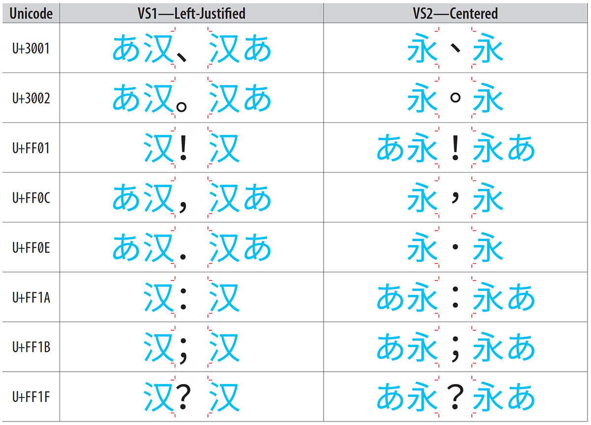
This article is largely a test, but also serves to start the process of resurrecting L2/14-006 (Proposal to add standardized variation sequences for nine characters) for discussion at UTC #151 in early May.

Liang Hai (梁海) brought up this document for discussion at UTC #150 last week, and while I had an opportunity to have it accepted by the UTC, to be included in Unicode Version 10.0 (June, 2017), I decided that it was prudent to instead prepare a revised proposal that is more complete, mainly because L2/14-006 was submitted and discussed prior to the first release of the Adobe-branded Source Han Sans and Google-branded Noto Sans CJK Pan-CJK typeface families. This functionality was implemented in those typeface families via the 'locl' GSUB feature, which requires the text to be language-tagged. In other words, I learned a lot since L2/14-006 was discussed, and prefer to submit a more complete proposal, even if it means waiting for Unicode Version 11.0 (June, 2018).
Continue reading…