
It seems that not a day goes by that I am not using Adobe InDesign CC.
It is my preferred document-authoring app, whether I am preparing a relatively simple single-page document or one that is much longer and complex.
Continue reading…

It seems that not a day goes by that I am not using Adobe InDesign CC.
It is my preferred document-authoring app, whether I am preparing a relatively simple single-page document or one that is much longer and complex.
Continue reading…
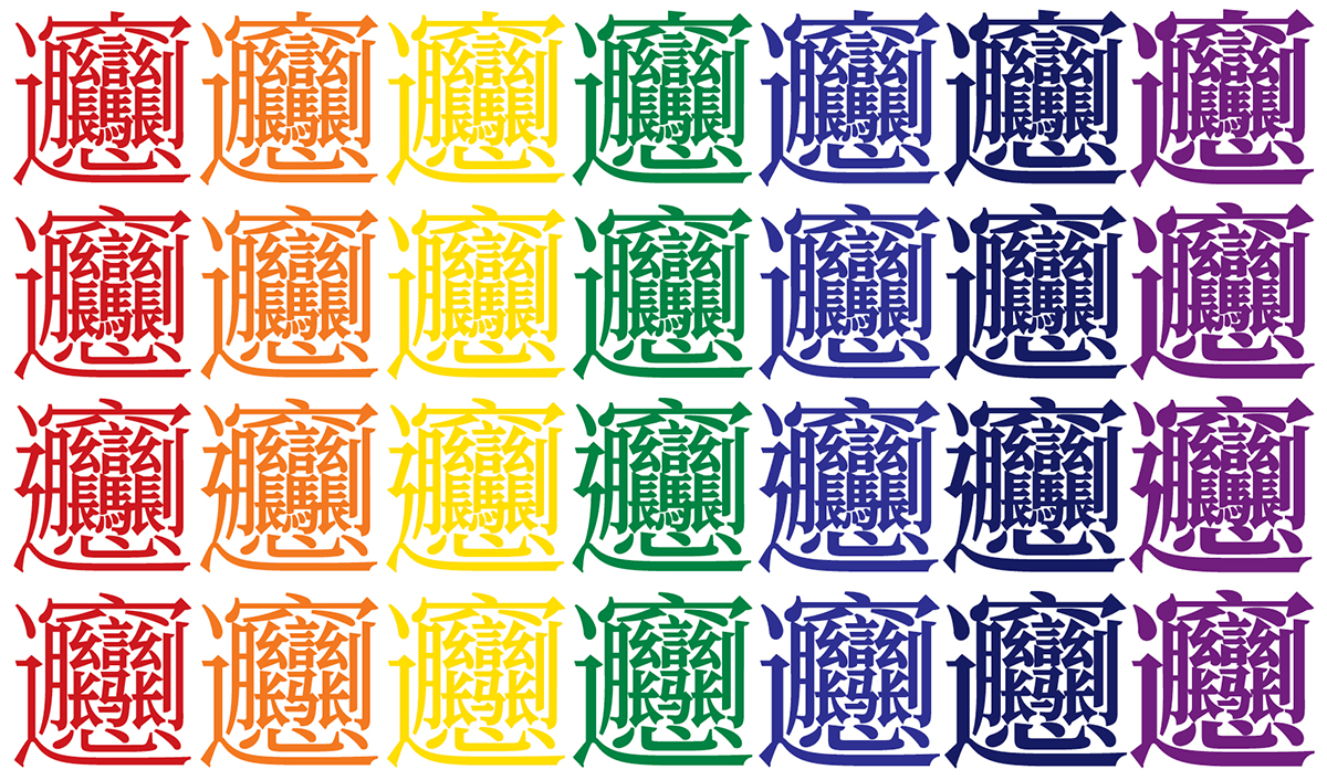
Besides being the world’s first open source serif-style Pan-CJK typeface families, the Adobe-branded Source Han Serif and the Google-branded Noto Serif CJK also represent the first broad deployment of two highly-complex and related ideographs that are in the process of being encoded. Their glyphs are shown above in all seven weights. Although it may be hard to believe, the fourth line illustrates the simplified version.
Continue reading…
Or, perhaps more accurately, the project that has been keeping me busy for the past couple of years.
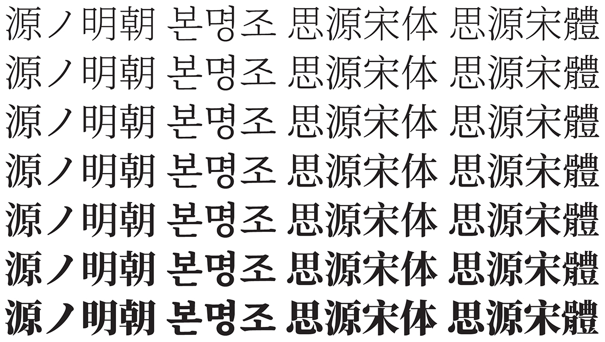
The Adobe-branded Source Han Serif (named 源ノ明朝 in Japanese, 본명조 in Korean, 思源宋体 in Simplified Chinese, and 思源宋體 in Traditional Chinese) and Google-branded Noto Serif CJK open source Pan-CJK typeface families, which represent the serif-style counterparts to the similarly-named and also open source Source Han Sans and Noto Sans CJK Pan-CJK typeface families, were released on 2017-04-03. You can read more about the Source Han Serif release here (日本語—한국어—简体中文—繁體中文), which includes a six-minute promotional video.
This article provides information that you would not expect to find in the official announcements for Source Han Serif or Noto Serif CJK, mainly because such information is intended for a completely different audience, which is primarily comprised of font developers.
Unless noted otherwise, all further references to Source Han Serif or Source Han Sans will apply to Noto Serif CJK or Noto Sans CJK, respectively.
Continue reading…

I will open this article by stating that OpenType features are almost always GSUB (Glyph SUBstitution) or GPOS (Glyph POSitioning). The former table specifies features that substitute glyphs with other glyphs, usually in a 1:1 fashion, but not always. The latter table specifies features that alter the metrics of glyphs, or the inter-glyph metrics (aka kerning).
The focus of this particular article will be the 'vert' (Vertical Alternates) feature, which substitutes a glyph with the appropriate glyph for vertical writing, and is invoked when in vertical writing mode. In other words, it’s a GSUB feature, and one that needs to be invoked for proper vertical writing. Current implementations that support the 'vert' GSUB feature, which tend to be CJK fonts, substitute glyphs with their vertical forms on a 1:1 basis, though language-tagging may affect the outcome for Pan-CJK fonts, such as the Adobe-branded Source Han Sans and the Google-branded Noto Sans CJK, which support multiple languages.
Continue reading…

It is now January 28, 2017 in China and other Chinese-speaking regions.
I’d like to use this opportunity to welcome the Year of the Rooster, and to wish a Chinese New Year to all of my Chinese friends, colleagues, and blog readers. May this year be safe, prosperous, and enjoyable.
Continue reading…
As recorded in The Adobe-Japan-6 Character Collection, it was released on 2004-03-05, and one of the glyphs that was added was CID+20958. According to the Adobe-Japan1-6 ordering file, its glyph name is freedial, and is assigned to the Dingbats FDArray element for the purpose of hinting. Of course, if you look for CID+20958 in Adobe Tech Note #5078, you can find it on the bottom of page 54, immediately to the right of CID+20957 that maps from U+26BD ⚽ SOCCER BALL, though it is blank. This is simply because Adobe does not have the rights to use NTT’s trademarked FreeDial mark. CID+20958 was included in Adobe-Japan1-6 for the benefit of font developers who do have the rights to use this mark, and can thus include the glyph in their fonts.
Continue reading…

Please pardon the apparent non-CJK interruption in the form of this particular article, but I wanted to bring to the readership’s attention a new open source project that has a very long history: ehandler.ps.
Continue reading…
To (significantly) expand yesterday’s super exciting article, and in the continued interest of (stress-)testing the extent to which combining jamo works in various browsers—and when being served as a fully-functional webfont via Adobe Typekit—if you click here, you will open a 40MB HTML file that includes all 1,626,875 possible three-character combining jamo sequences (125 leading consonants, 95 vowels, and 137 trailing consonants) rendered using Adobe Clean Han and its 'ljmo' (Leading Jamo Forms), 'vjmo' (Vowel Jamo Forms), and 'tjmo' (Trailing Jamo Forms) GSUB features.
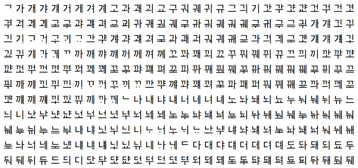
In the interest of testing the extent to which combining jamo works in various browsers—and when being served as a fully-functional webfont via Adobe Typekit—if you click here, you will open a 200K HTML file that includes all 11,875 possible two-character combining jamo sequences (125 leading consonants and 95 vowels) rendered using Adobe Clean Han and its 'ljmo' (Leading Jamo Forms), 'vjmo' (Vowel Jamo Forms), and 'tjmo' (Trailing Jamo Forms) GSUB features.
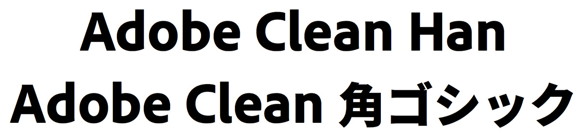
As a follow on to our seven-year-old May of 2009 article of the same name, several things have happened with the Adobe Clean family that have yet to be reported, and which have CJK implications. Hence the reason for spending my Sunday morning writing this article.
In the following year, 2010, I developed and deployed a Japanese version of Adobe Clean named Ryo Clean PlusN (りょう Clean PlusN in Japanese), and then in 2015, I developed and deployed a Pan-CJK version named Adobe Clean Han (Adobe Clean 黑体 in Simplified Chinese, Adobe Clean 黑體 in Traditional Chinese, Adobe Clean 角ゴシック in Japanese, and Adobe Clean 고딕 in Korean). These typeface families are Adobe corporate fonts that are meant to be used for product literature, for serving to Adobe websites, and for use by Adobe apps. They are not meant to be used by our customers, but I suspect that the readership of this blog may be interested in some of the development details. If this interests you, please continue reading.
Continue reading…